A Deeper Look into Chartio's Visualization Library – What's New and What's Improved
Posted by on November 30, 2020 Chartio
Last week, we unveiled our brand new visualization library. Chartio charts are now based on the modern, open-source Vega and Vega-lite projects. Chartio customers can now enjoy more customizable, smarter and extensible, charts to create extensive and beautiful visualizations.
On November 17th, I joined Dave Fowler, our Founder and CEO for a live webinar to demonstrate how Chartio customers can take advantage of every new and enhanced feature. We also shared some best practices that we follow internally to create our own Chartio dashboards. We’ve compiled a list of each new feature below to help you quickly understand what’s available in our new visualization library. We’ve also answered the most common questions we’ve received from our customers to help you and your team get started on the path to artful dashboards.
Design
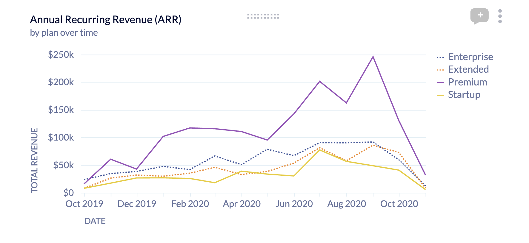
Subtitles
Subtitles are a helpful way to add additional context to a visualization. Instead of having to add additional text elements or have long chart titles, subtitles offer a subtle way to add the context necessary for chart viewers to fully understand what the chart is doing.
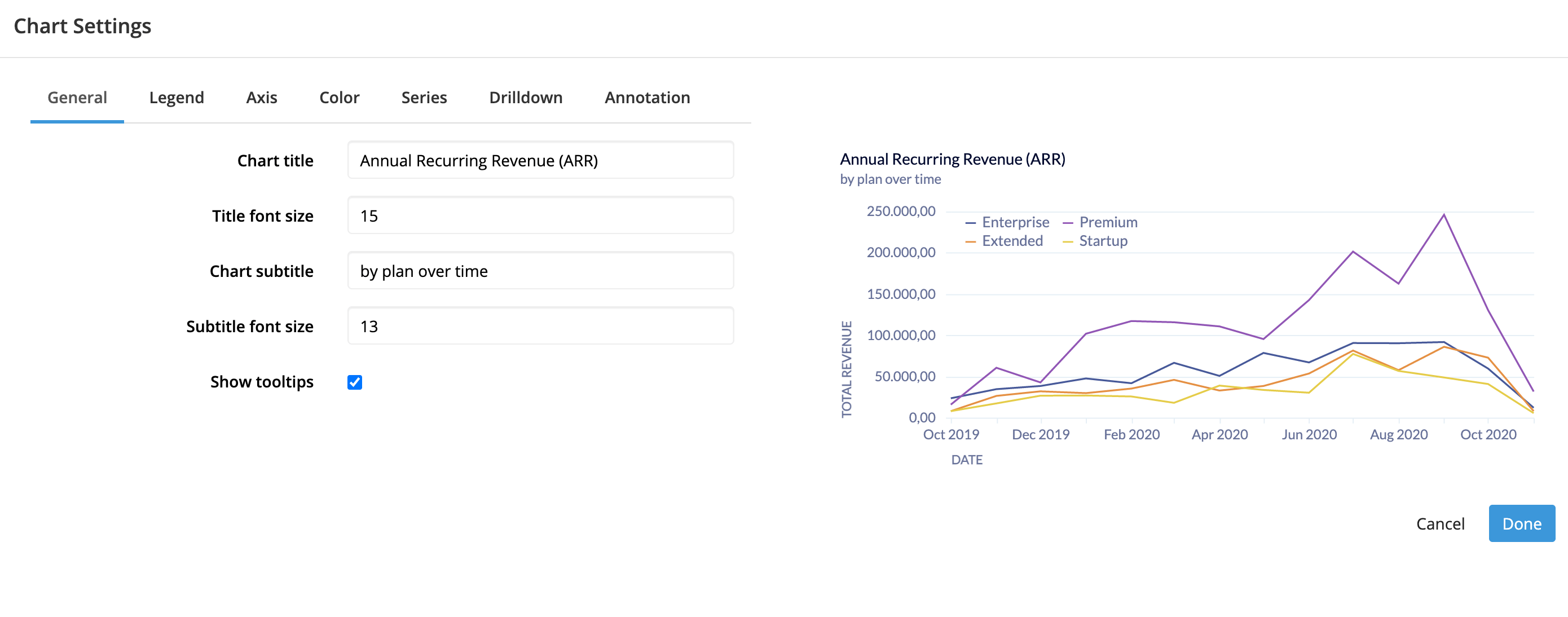
Chart Design
We’ve also added a ton of new options for configuring how a chart displays. This includes font controls on nearly every element in the chart. For example, all of the following can be controlled independently by the theme:
- Title title font family, size, style, and color
- Subtitle title font family, size, style, and color
- Axis title font family, size, style, and color
- Axis label font family, size, style, and color
- Legend font family, size, style, and color
- Value labels font family, size, style, and color
This highlights the level of customization we plan to allow in our charts moving forward. While it isn’t possible for customers to set their own styles for these elements in custom themes, it will be in the near future.
Label Formatting
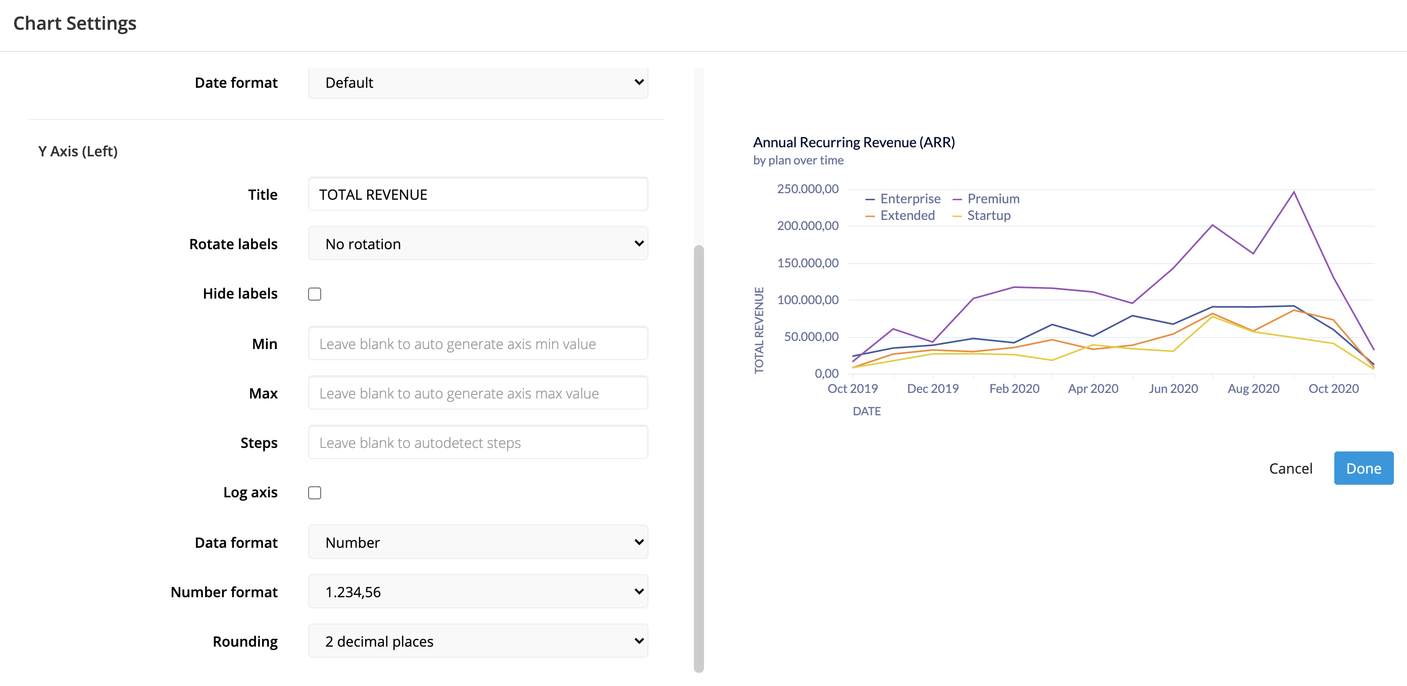
Customizing the axis labels is an important part of the chart design process. Numbers are read differently across the world and many times, those numbers convey more than a numerical value. They may represent a specific currency or percentage value. We wanted to incorporate these facts into our numeric and date formatting, to globalize our chart offering as well as contextual the data those values represent.
For date formatting, we have gone from 2 date formats to 6:
- Default (Mar 28, 2019)
- Short (5/28/19)
- Medium (Mar 28, 2019)
- Long (March 28, 2019)
- Full (Tuesday, March 28, 2019)
- ISO (2019-05-28)
Numeric formatting has even more options. There are 4 distinct settings when formatting numeric values. Those are:
- Data type
- Number
- Percentage
- Currency
- None (No format)
- Number format
- Various number formats to help globalize charts
- Currency
- Various currencies
- Rounding
- No rounding
- Round to integers
- 2 decimal places
- 3 decimal places
- Abbreviations (1K)
Legends
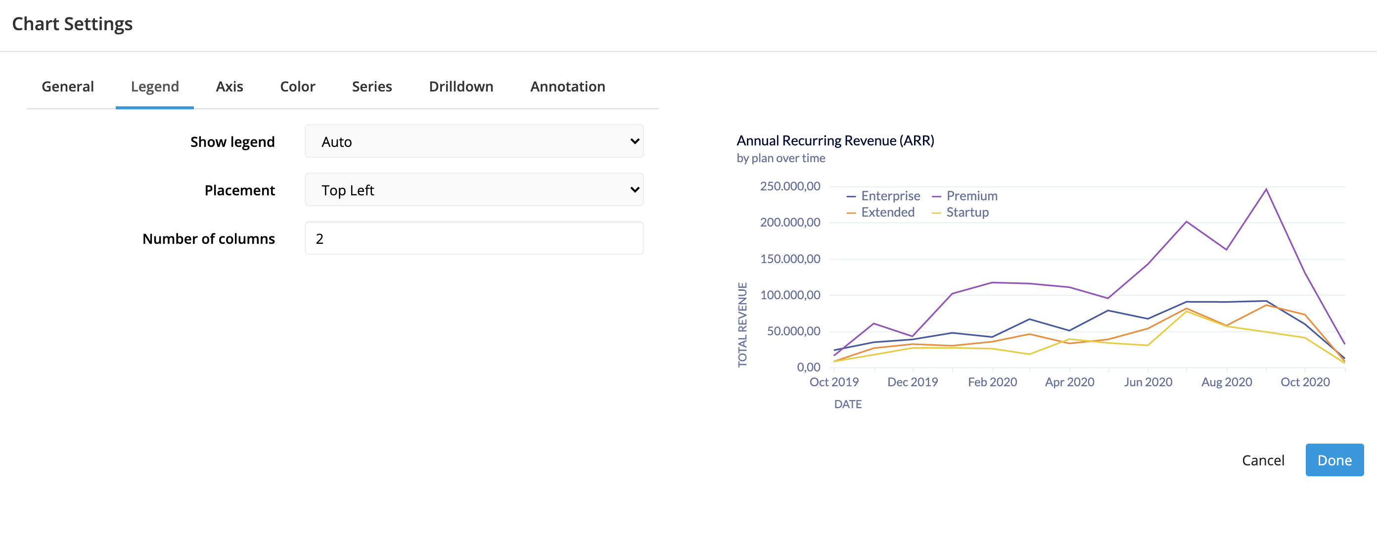
The needs for legends vary depending on the chart and the number of series visualized. Sometimes a legend looks best to the side, sometimes up top, sometimes inside the chart itself. We now offer these options to help users visualize their chart exactly how they want it visualized.
- Legend placement settings include:
- Inside the Chart
- Top Left
- Bottom Left
- Bottom Right
- Outside the chart
- Top
- Bottom
- Right
- Left
In addition to controlling where the legend is placed, you can also control the number of columns shown. By default, the legend will show in a single row but if you set the number of columns, the legend will reorient to show only that number of columns with multiple rows.
Little Things
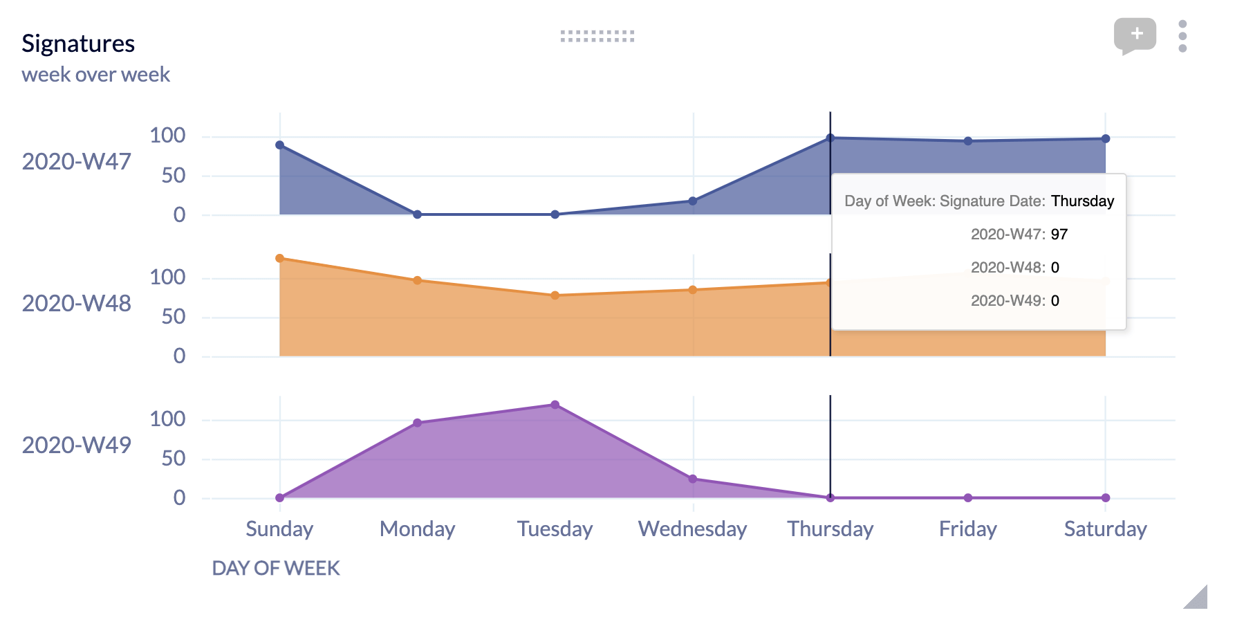
Legends don’t just show color, they show style as well.
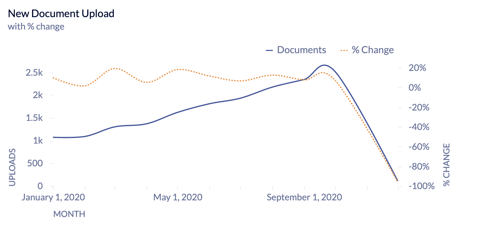
Axis labels don’t get clipped on the edges of charts anymore.
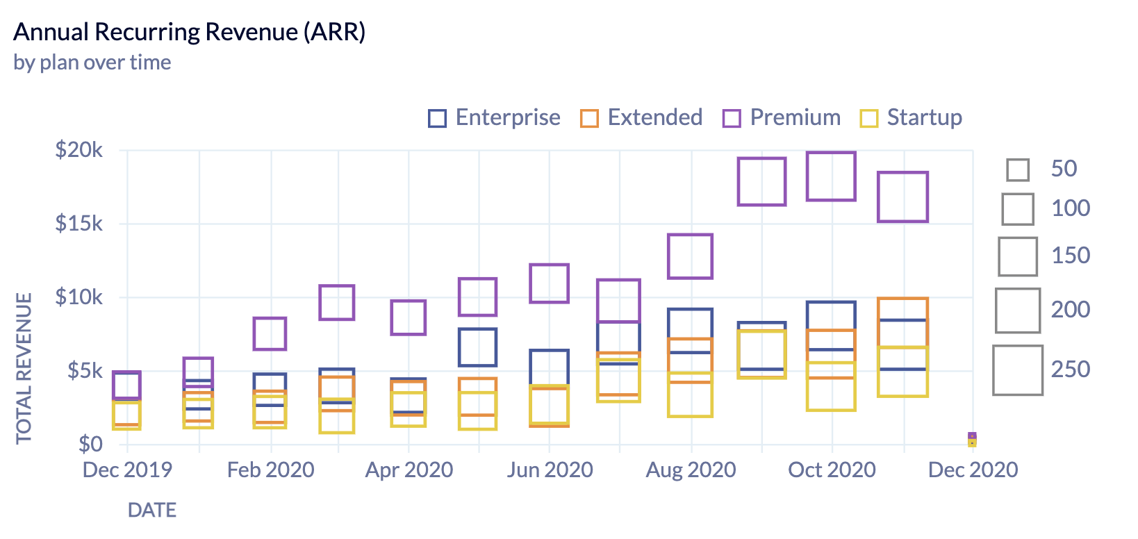
Chart Specific Settings
Scatterplot
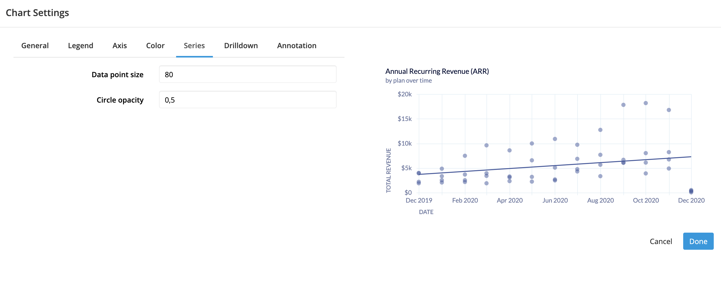
Scatterplots need fine grained control over the dot size and opacity. Today, we only offer 3 options for dot size. Now, we offer a detailed control of both facets of scatterplots to customize the look and feel.
Maps
We’ve updated our maps to include a couple new maps. In addition, the maps are based on Topojson standard which makes it much easier to add additional maps. Some of the new maps include:
- US county
- France department
- UK county
- North America
- South America
- Asia
We plan on adding more maps like US zip code and eventually allowing users to load their own topojson files.
Lastly, the maps just look better. The projections are better and the overall map is higher quality. We offer color choices for the stroke (region lines) and NULL value color, in addition to the expected map color.
Bubble Maps
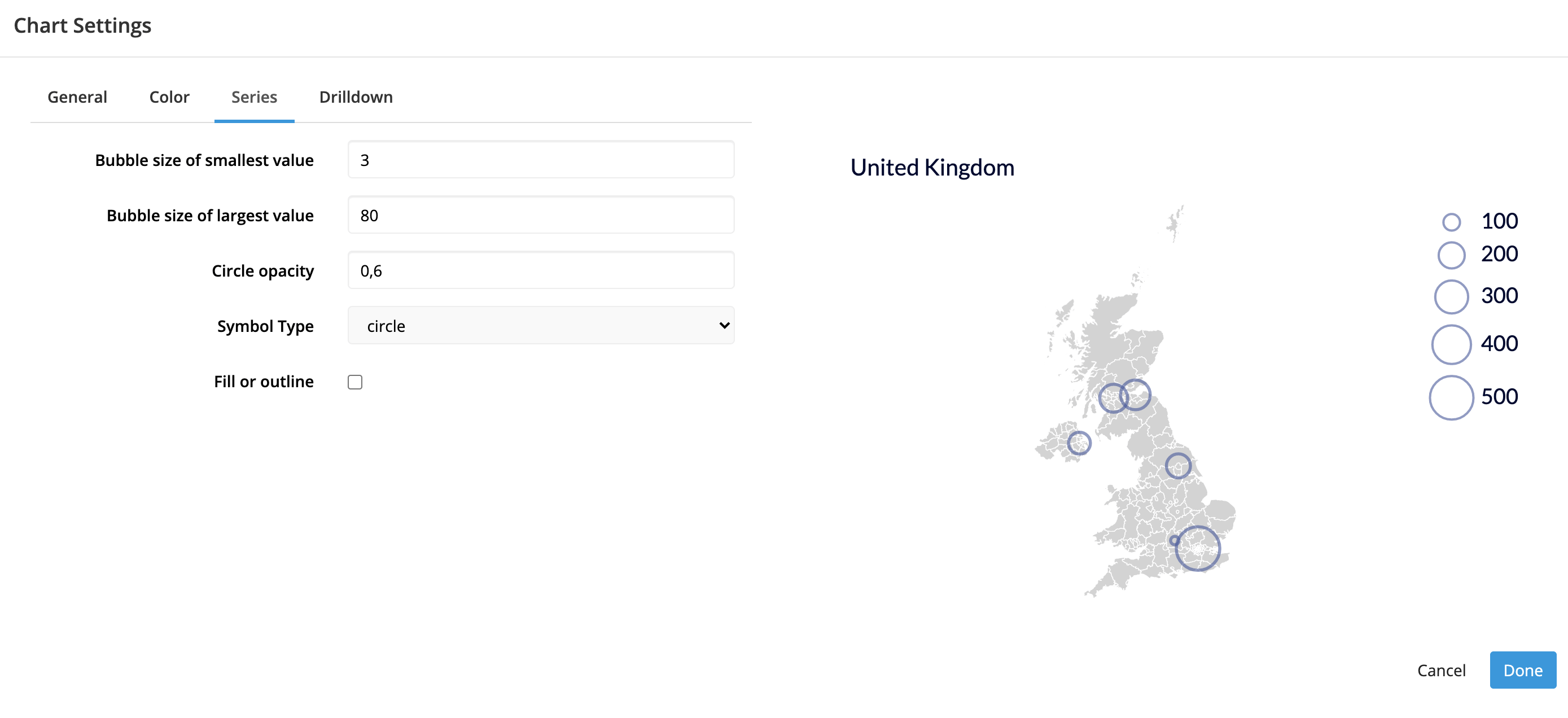
In addition to all the above, bubble maps offer granular control of the bubbles much like scatterplots and bubble charts. The minimum and maximum bubble size, opacity, shape, and outline are all configurable.
Previously, only bubble size and outline could be configured.
Line and Area Charts
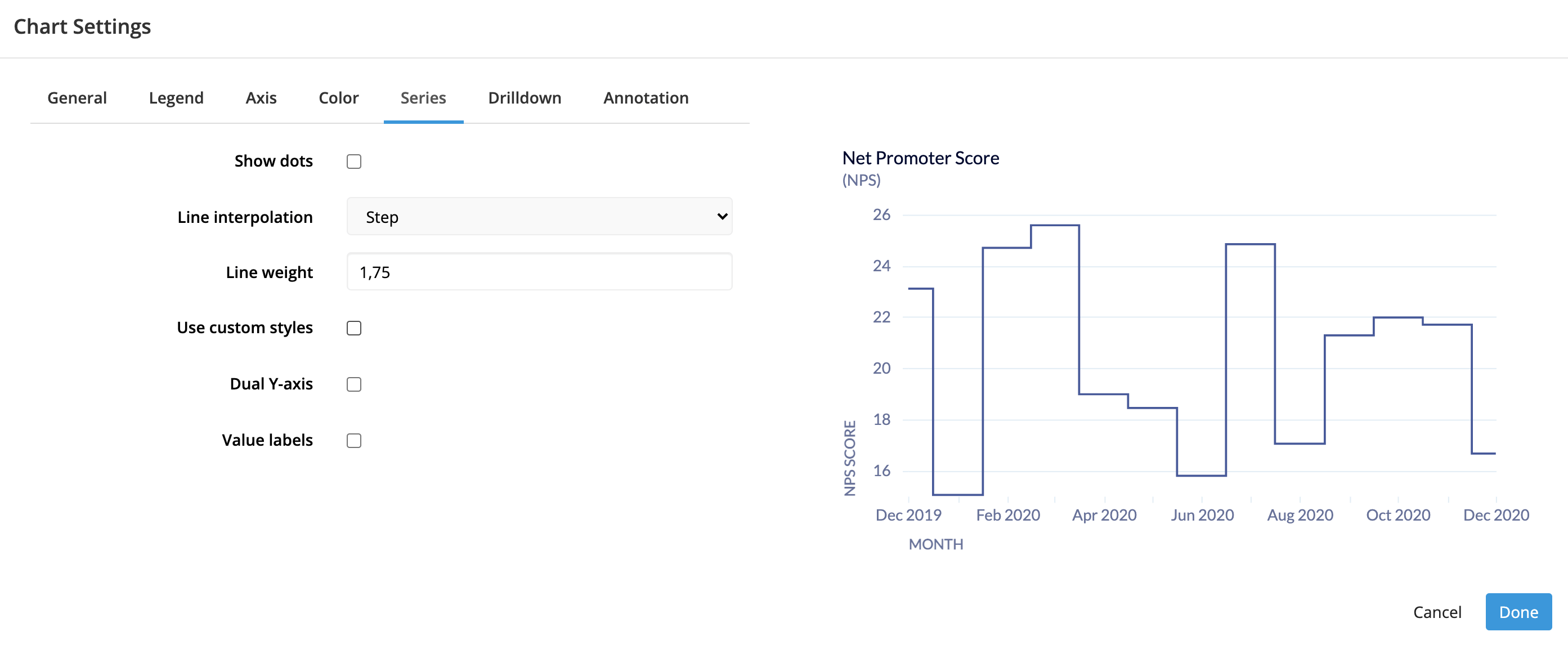
Line charts now offer a new interpolation option - Step.
Sparklines
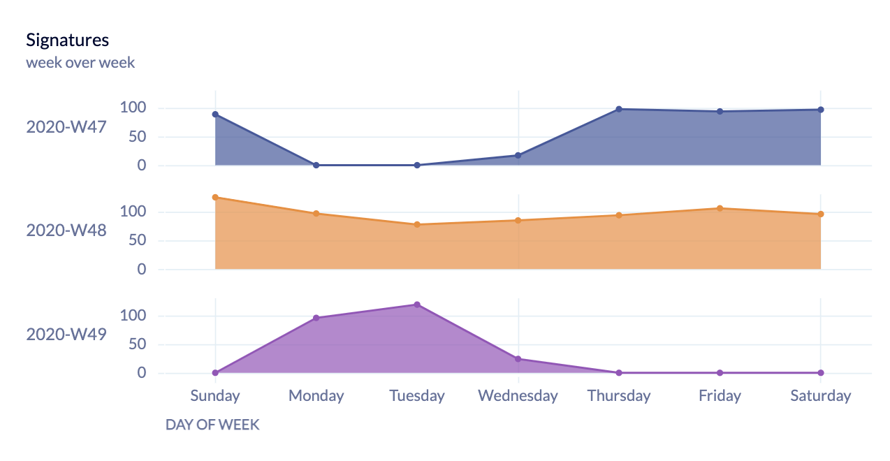
Sparklines now offer the same Y-axis options as all other cartesian charts. Previously, the Y-axis would only show the series label, not the axis, axis labels, or axis titles.
Your Top Questions Answered
1. How’s the performance on large dashboards?
Vega and Vega-lite are Javascript based libraries that are being rendered on the front-end. So users might experience a slight delay in the process at first. However, we are planning to move to a canvas based approach in the future, which will improve our entire dashboard performance.
2. D3 often gives more granular and low-level control than Vega. How would you contrast what you’ve built with Vega vs what’s possible with D3?
Vega is a low-level grammar built right on top of D3. We’ve created our own branch in Vega to add anything we may need from D3 to the project, so there should not be any limitations on what we can achieve with Vega.
3. Are you planning on adding the ability to have multiple y-axes in addition to the standard 2?
While we have not discussed this yet, this is something our customers will be able to pull into Chartio. If you do so, please share some examples with us on #data-viz channel on our Slack channel, we’d love to see them!
4. Would it be possible to add custom maps by adding something like a shapefile?
Yes, user uploaded shapefiles are on our roadmap. We want our customers to be able to pull in specific maps using the iframe charts, if we don’t offer it.
5. What about alluvial diagrams? Is that going to be a default chart type?
Yes, we are already working on adding alluvial diagrams and sankey charts to our chart library.
6. Any plans to add formatting to data labels?
Yes, we’re continuing to improve features like tooltips, formatting, customizable value labels, and you can expect to see them soon.
7. Do you have plans to add filters automatically to all dashboards?
Yes, this is called reusability. While this wasn’t covered in the webinar, our product team is internally discussing this and looking for ways to solve this pain point.
8. Does the update in viz library mean there will be a change in the back-end with how data is set up?
No, not at all. While we are now rendering our charts with Javascript, the way our customers’ data is set up has not changed.
9. Are you planning on pursuing the ability to zoom in on a map and let users define the geographical area?
Yes, map interaction is a priority for us . We’re considering features that will allow our customers to zoom in on maps or upload their own JSON files.
10. Are there plans to add dynamic annotations?
We’re focused on making our basic annotations great first, but we have a bunch of cool ideas around how we want dynamic animations to work between charts and within charts.
11. Do we have control on how many series are shown in the legend?
We’re considering and leaning towards adding this feature into our chart settings.
12. Are there plans to allow embedding to allow chartio visualizations in other applications?
Yes, we do have this! Check out our Interactive Embedding page for more information.
13. ThoughtSpot is also looking at migrating to Vega. Will ThoughtSpot and Chartio end up looking the same on the front end?
There are a number of companies that use Vega. For example, Looker uses Vega, but their dashboards look different from ours. Instead of using default colors or fonts, we use our custom settings. So I don’t think they’ll look the same, nor have the same extensible settings.
14. Can iframe charts use data from your backend?
Yes, that’s the whole point of implementing this feature! Customers still use Chartio and Visual SQL to load/explore/transform that data and our dashboards, but charts can be rendered by any available visualization libraries.
15. Is there any reduced functionality or automatic updates for existing charts in the old style?
There should be no detrimental functionality our customers will lose from our updated viz library. However, if you use our new themes, you’ll notice the old ones aren’t quite as compatible.
16. Do you plan to add countries for detailed maps?
Right now, our focus is on releasing the most requested maps first. But we are planning on expanding our map chart types. We’re considering different options, whether we want to add a search capability or make it an upload option through iframe charts.
What’s next
As we mentioned in previous posts, our main reason for changing our visualization library and re-writing on top of Vega was to increase the speed at which we could continually develop.
We’ve found that to be successful so far – in fact this initial release wasn’t even intended to have more features than the old visualization library. Our first priority was to get backwards compatible. But the new library is so much better and faster to develop on we’re well on our way to major enhancements and see our momentum only increasing.
