The Power of Data Collection – How We Improved Our Product with User Tests
Posted by on November 29, 2020 Chartio
In early 2019, we thought we were doing a pretty good job of achieving our mission: “make data accessible to anyone.” According to the industry and our customers, we were achieving this goal compared to our competitors. But looking inward at our own data told a very different story.
Now, our mission is a little vague (as mission statements tend to be), but it carries specific meaning to us. As we say on our product page, we specifically want to “empower anyone—not just data teams—to easily understand the data they need to succeed at their jobs.”
We’re not pitching ourselves here (though you can start a free trial right now if you want 😉) — we’re laying out our definition of success. In short, if we’re “making data accessible,” then we’re achieving our mission. And according to the BI industry at large, we were (and still are).
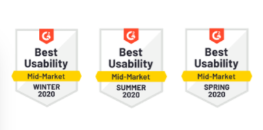
For the last few years, Chartio has topped many rankings for “best usability.” G2 ranked us as the most usable business intelligence platform four years in a row, from 2017 through 2020.
If you peruse the reviews submitted to the likes of TrustRadius and Capterra, you’ll find comments like, “With Chartio, you can run from data to visualization in seconds, even if you don’t know SQL” (Source) and “[The] user interface is very easy on the eyes and intuitive”(Source).
This was all great to hear and seemed to say that we were on the right track. Might as well pat ourselves on the back and say “mission accomplished,” right? Well, the reality of the situation reared its head once we took a closer look at our user data.
Turns out that at the start of 2019, only one in ten users could successfully make charts and work with data in Chartio. You’re not “making data accessible,” when nine out of ten users can’t use their data to make a chart.
So we decided to start digging. Why are we winning these awards and receiving such great feedback when we’re demonstrably behind on achieving our definition of success?
So, We Ran Some User Tests
To understand how we could improve our product and fulfill our mission, we ran user tests with UserTesting starting in early 2019. Our aim was to find out why nine out of ten users had trouble using their data to create charts.
Running user tests is a systematized way of collecting data on how your product gets used. The tests themselves consist of us giving the user a task to complete and then recording their process for completing that task within our product.
Often, you’ll take the insights from one test, design a new variation of your product, and run a test again on that new design. Over time, you’ll home in on what works and what doesn’t. For instance, does the position of a certain button significantly change the workflow in your product? What if you changed the color of that button? And on and on.
Running this program over a few quarters means managing a lot of moving parts. So we created a task force, whose responsibility it is to
- create a plan with our initial thoughts,
- create a spreadsheet to track results,
- create prototypes in Figma, and
- run user tests with UserTesting.
We relied on our product managers and engineers to lead this task force, but input from other teams was encouraged. Everyone could view the plan, the results, and even watch the recording of each participant trying out the prototype. We earnestly believe input and insight can and should come from everywhere.
Our Big Insight: This Is an Industry-Wide Problem
In mid-2019, after about three months of running tests, tweaking designs, running another test, tweaking designs again, and on and on, we still hovered around that stubborn rate of one in ten users successfully creating charts. We must’ve been missing something. So we decided to run user tests on our competitors.
Turns out that our one-in-ten rate blew our competition out of the water. We were closer to achieving our mission than any other tool in the BI industry. No one came close. And there’s a reason for this — there’s a reason why, in the last 35+ years, BI platforms haven’t meaningfully made progress on data usability.
Data is complex. And the language we use to query and work with data — SQL — is ancient (by coding-language standards) and unwieldy.
You just can’t get around these two issues. It was clear to us that making small changes here and there wasn’t going to solve the problem, because the problem of usability in business intelligence was systemic. Watching users struggle with every BI platform was a huge wake-up call for everyone at Chartio. We didn’t want to be the BI platform users struggled with the least. We wanted to eliminate that struggle entirely.
Out of that desire came Visual SQL. Once we identified this larger problem with the industry — that no one had solved the usability problem in business intelligence — the whole team at Chartio became energized to completely reconstruct how our users queried and leveraged their data. You can read our full thoughts on Visual SQL here, but the core takeaway is that the insights underpinning Visual SQL were only made possible with user tests.
And Visual SQL had an immediate impact. We started incorporating early versions into our user tests in mid-2019. Once we did, that one-in-ten rate jumped to six in ten. But that wasn’t quite good enough. We kept iterating, and after about another month or so, we landed on eight out of ten users leveraging their data to create charts.
Let’s zoom in on how, specifically, we were able to do this with what we called “measures” and “dimensions” in our product at the time.
Our Solution: Simplify but Don’t Shy Away
Overall, we found that there were many steps in the dashboard and chart creation process that were needlessly complex. Often, BI platforms (ourselves included at the time) build features and workflows that try to smooth over the process of working with data and SQL.
We found that our users didn’t need to or even wanted to skip over these steps. They needed the steps to working with data to be broken down and made clearer. One prime example of this was how we turned “measures” and ”dimensions” into a part of Visual SQL.
The Complex Way to Start a Query
Back in mid-2019, at around three months since we’d started testing, one thing was super clear to us: we needed to simplify the first steps of creating a query. In Chartio at the time, these steps were taken care of using “measures” and ”dimensions.“ But users just didn’t understand what these were or how they worked.
Put simply, “measures” are columns of data being pulled from the database, and “dimensions” are how you want to group or break up the data. This functionality is super common among BI platforms — Tableau calls it rows and columns, and Power BI calls it groups and values.
To start your query, you need to drag your row/group/measure to the columns/values/dimensions. Depending on where you drop the row/group/measure, different actions happen to it. If you find this confusing, you’re not alone: so did the people in our user tests.
We were asking the user to complete two steps at once:
- Select your data.
- And decide how you’ll use it.
Thinking through these two steps at one time was difficult enough to keep nine out of ten users from fully leveraging our product. It was just too complex.
The Simpler Way to Start a Query
The answer was to split up the steps. With Visual SQL, we decided to ask users to first select the columns of data they wanted to use. Just focus on that.
As they selected this data (which they could preview in real time, by the way!) Visual SQL would populate in the results table below, which functioned pretty closely to a spreadsheet. Later they could apply filters. Later they could group or break up the data. Here’s a video of it in action:
Here’s the kicker, though: throughout the last ten years, we’ve gathered a lot of data on how people build queries.
By analyzing this data, we found we could predict, with 88% accuracy, how users would want to use their data. So as they selected their data, we could have Chartio working in the background, preparing the next step for them in the Results table.
Even if we predicted wrong, giving the user something to react to was super helpful. It was the old “I’ll know it when I see it” phenomenon. It reduced an open-ended question of how you wanted to use data to a yes/no binary.
In the end, instead of giving our users an ambiguous workflow of dragging measures to dimensions, we gave them two simple choices:
- What data do you want to use?
- Do you want to use it this way?
With user tests, we could try out this approach of not glossing over a complex workflow. We leaned into it. Broke it down and made it accessible. We took a two-step process and made it two steps instead of one.
And our users immediately responded. They could create queries faster and easier. And by the end, we were able to achieve a rate of eight out of ten users creating charts. Not perfect, but good enough to get it live and to keep iterating.
Best Practices We Identified
While working with user tests to perfect our product and, ultimately, move the BI industry meaningfully forward, we identified a few user-test best practices. This article has a few outlined We hope you can use them to identify insights about your product that are just as impactful.
Best Practices for Getting Started with User Tests
- Create a plan before starting. This plan should contain all the questions you have on how users leverage your product, hypotheses on how to improve, and the experiments you’d like to run. This is a significant amount of up-front work, but having this central document saved us a ton of time.
- Conduct a handful of tests at a time (no more than five). You will be surprised by how users behave, no matter how much planning you do. So start with a few tests to test the water, find issues, optimize processes, and more. Think of your first few batches of five as a dry run. Then, adapt your plan before rolling it all out on a larger scale.
- Don’t make the tests too long — the shorter, the better. Watching videos, reviewing tests, and taking notes take time. Make sure they’re less than ten minutes if possible.
Best Practices for Scaling User Tests
- Track everything. Score every test and every question, and take detailed notes. This is so you can go back later to easily search for highlights and find trends.
- Generally, you’ll want to run 50-100 tests before drawing big conclusions.
In other words, don’t read too much into the results from a small number of tests. Look for patterns from macro trends. This is how we identified the problem that led to the development of Visual SQL. So make sure you have a large pool of tests to work from before moving forward:
- For tests that quickly averaged five or six out of ten users successfully accomplishing the task, we ran 50-100 tests. In these cases, we knew something about our design was off and that we needed more information.
- For tests that quickly averaged nine out of ten users successfully accomplishing the task, we ran around 20 tests. A rate that high usually meant that we’d gotten something right and we just needed to confirm.
- Make subtle changes before reengineering things. Before overhauling workflows and processes, try changing colors, fonts, and placements. These have incremental impacts that build over time, and the insight you draw from how people react to these changes can help you identify larger macro-trends.
Best Practices for Iterating on User Tests
- Know your target audience. The people you run user tests on should be the same people who will use your product. Because we wanted Chartio to be super usable, we cast a very wide net but started with technical people.
- Set specific goals and know what you’re measuring. Our end goal was to get as close to ten out of ten users finding it easy to use their data and create charts in Chartio. We also broke this down to each test. We wanted to make sure a certain number of users could easily complete a task before we moved on.
- Err on the side of vagueness. That is, don’t lead the user on with your questions or prompts, and don’t use terms from your product. If we were too specific with our questions and prompts, the users would complete the test super quickly because we helped them along the way. For example, if the user were creating a product report, we’d ask them to “find the number of new users in the month of August.“ And we’d leave them to it.
We also put together this checklist which, while fairly short, will help you and your team think deeply about and gain alignment around the user testing process.
Access Our User Testing Best Practices Checklist >
Where to Go from Here
Using data from your user tests to improve your product is flat-out one of the best ways to stay agile and resilient as a business. It allows you to iterate and identify opportunities that entire industries have missed.
Feel free to use this article as a high-level blueprint for running user tests yourself. Keep in mind that once you start, you won’t want to stop. In fact, we continue to run user tests like these right now and have some exciting releases coming out in late 2020, like our new Vega visualization library.
If you’re interested in seeing the results of our user test insight in action, start a free trial and try it out yourself.