How to Improve Data Accessibility as a Data Analyst
Posted by on February 10, 2021 Chartio

What if you could advance your career by getting others to do your work? When you, as a data analyst, improve data accessibility for your organization, you might get exactly that. You empower others to find the answer they need, and thus do your work for you.
Data accessibility is the degree to which people in your organization can use data. That is to say that data isn’t just available, but usable — even for people with little to no experience working with data.
As a data analyst, you have an opportunity to change how your organization uses data by taking a few specific steps to improve data accessibility. In the process of changing how your organization uses data, you will not only help your coworkers use data to improve their decision making, but set yourself up for a great career.
Lean On Self-Service Business Intelligence
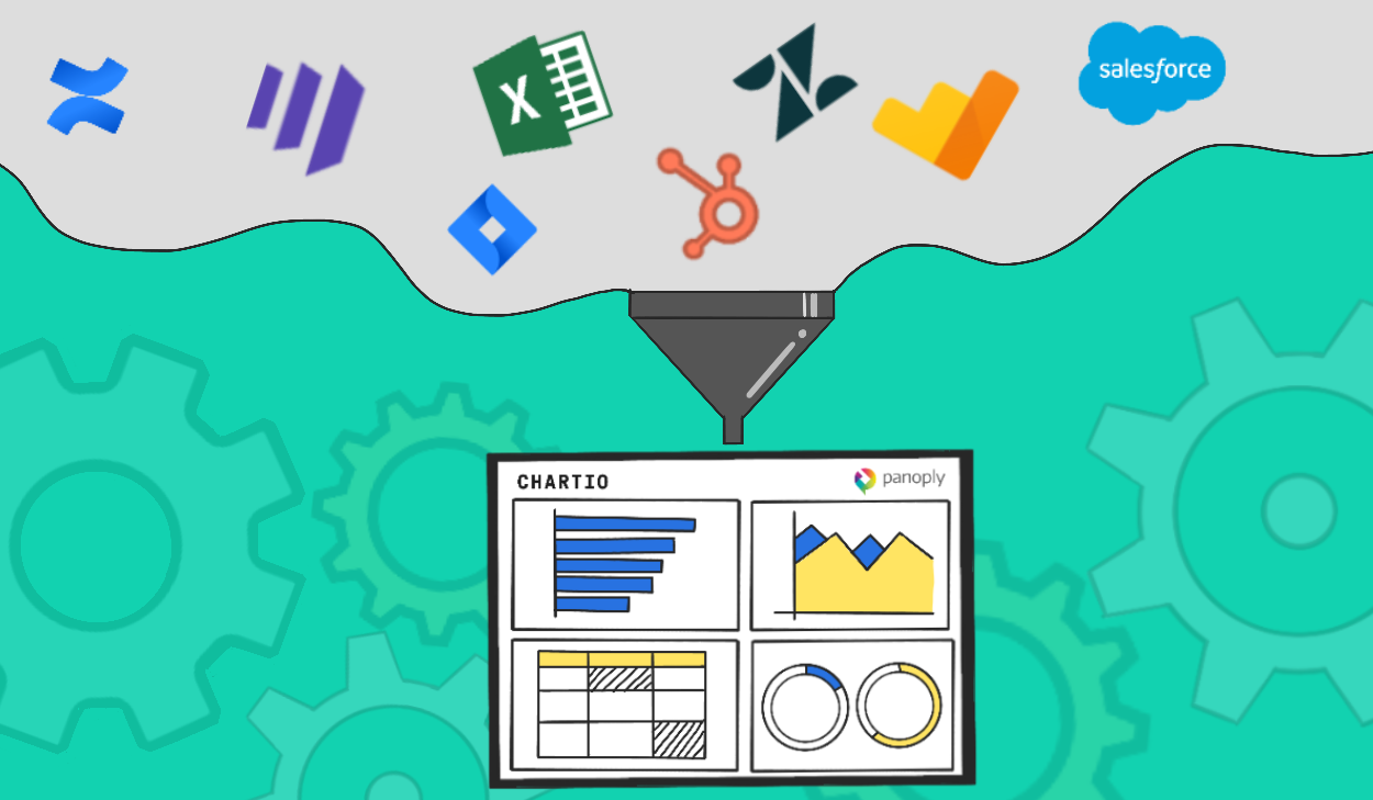
A self-service business intelligence (BI) platform empowers your coworkers to take care of their own ad hoc data requests. When implemented well, a self-service BI platform allows anyone in your company to build dashboards and reports for themselves on-demand, no matter their level of expertise.
A self-service BI platformprioritizes ease-of-use for the end business user. There are numerous quality-of-life and automation features these platforms might have to improve data access, including low or no-code SQL query builders (like Visual SQL), automatically generated visualizations, and drag-and-drop dashboard creation.
These features combine so that anyone can query data, perform data analysis, and create their own dashboards and reports with little to no effort on your part. As an analyst, you likely receive a lot of ad hoc requests for dashboards or quick reports. All of thosead hoc requests for a dashboard or quick report will go away (or at least be drastically reduced) because your coworkers can help themselves.
Alex Knowles, Director of Strategic Initiatives at DataRobot, says that he and other leaders at DataRobot (who have gone all-in on accessible data) tell employees to “Take an afternoon and teach [the process of creating dashboards] to yourself. Don’t complain about analysts not having time to help you, just go figure it out [with Chartio].”
Music to a data analyst’s ears. But the best self-service BI platforms go even further.
A good self-service BI platform is quick to implement and provides an easy way to connect multiple data sources and datasets, from Google Sheets to Amazon Redshift. Power-user features, like a robust SQL editor and schema management, also won’t fall to the wayside with a good self-service platform.
The best of the best will have built-in (but removable) guide rails for people who don’t have extensive experience working with data. These guide rails help data newbies stay on track when creating visualizations and can even teach best practices.
Embed Dashboards Into Your Teams’ Tools
When you need a standardized dashboard to serve as a source of truth, embed it into the tools your coworkers use. Embedding dashboards that answer common questions where your coworkers spend the most time will go a long way to improving data accessibility.
Some self-service BI platforms allow you to embed dashboards wherever there is an HTML iframe. There are some tools out there that focus solely on embedding analytics, but with a self-service BI tool (like Chartio 😉), you can embed dashboards in addition to all the other features. With a platform like Chartio, not only is the dashboard easy and quick to create, you can place it wherever it’s needed — on your website, within a tool, and even within your product.
When you embed a dashboard in a commonly used tool, for instance, your coworkers are able to find the information they need to make data-driven decisions without leaving that tool.
Say you embed an interactive dashboard directly into Salesforce to help your sales development reps. That dashboard can include relevant data about warming up a lead while they’re speaking to that lead.
Embedding dashboards is a great way to improve data accessibility without asking your coworkers to do more work. You can create a dashboard once, place it wherever it needs to be, and that data will become available and usable for everyone to collaborate with.
Facilitate Data Literacy Throughout the Company
Improving access to data includes making sure data gets used well. Create a plan to teach your coworkers data literacy so they can interpret and use the data you’ve given them access to in an effective, accurate way.
As intuitive as a self-service BI tool can be, and as convenient as embedded analytics can be, there is still the potential for data stakeholders to misunderstand or misrepresent data. Concepts like selection bias and the difference between relative and absolute change may come easily to someone who works with data daily, but not so much for a salesperson who wants insight into the success of their cold email strategy.
To promote data literacy, you could hold monthly workshops, create a collaborative Slack channel, build an internal knowledge base, or read through Chartio’s Data School.
Clever, one of our clients, has a Slack channel called the“Number Munchers” filled with data newbies sharing tips and tricks for using Chartio and their data better. Creating a Number Munchers equivalent channel may be the easiest starting point for you.
Increasing the accessibility of your data is an ongoing process, and by promoting data literacy, you can start to create a culture of data collaboration that starts to feed into itself. Over time, you’ll help build a long-lasting culture of collaboration using data.
Embrace Your Changing Role
As you make data more and more accessible, your role will start to shift from the person who delivers insights to the person who helps others find and use their own insights. This shift is a part of a much larger change happening in the world of data that, as a data analyst, you can lead within your organization.
Improving data accessibility has become so important in businesses big and small that it’s starting to change how people think about data analytics. The goal for improving data access varies for each business, but usually revolves around getting people the right data, at the right time, so they can make the right decisions.
A new data role is starting to emerge (which was first noticed by the folks at dbt) that can serve as a next step for your career as a data analyst. That role is the analytics engineer, whose responsibility it is to address the more technical aspects of making data accessible, like data modeling, data management, standardizing metadata, ensuring data quality, and establishing methodologies and data-based workflows.
The new analytics engineer role is just one part of this larger change happening with how businesses use data. Modeled data is higher-quality data, which, in the hands of your data stakeholders, makes your self-service BI platform more and more powerful. This creates a self-feeding loop, where your increasing data quality improves data access, which allows you to focus even more on quality.
As more data becomes available and easier for the end business user to use, businesses of all sizes will increasingly rely on data as a sort of central nervous system for collaboration.
Start Making Data Accessible Today
No matter what, you need a self-service BI tool to start the process of improving data accessibility. That way, you can begin by making everyone their own data analyst, then start embedding dashboards once they move beyond the need for ad hoc dashboards.
And wouldn’t you know it, we have a suggestion to help you get started. Chartio is a self-service BI platform whose mission is to “make data accessible to anyone.”Start a free trial right now and start making data more accessible within your organization today.


