Optimize queries with chart performance analysis
If you regularly see “unable to fetch data” and want to know why it’s not fetching, here are some useful steps to take and tools within Chartio to use.
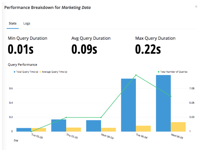
Hover over the chart which you would like to see the stats for. Click the ellipsis in the top right corner and choose Performance. This opens the Performance Breakdown chart which sums up the stats from the last two weeks. Provided are the minimum query duration, average query duration, and maximum query duration.

These numbers can be used to identify the cause of the error message regarding data fetching. The biggest indicator is the average query duration; the minimum and maximum will help to provide context around the average query duration.
- If both your average query duration and the minimum and maximum query durations are high, then your chart is taking too long to load because of the query itself. This can be alleviated by improving query performance or Data Stores.
- If you average query duration and the maximum duration are high but the minimum duration is low, then this could indicate that the problem is related to your database’s performance. For example, at certain times of day, the database load can be high which causes your query to run slow as compared to when the database load is light, allowing queries to run efficiently. This can be investigated further through the database usage stats.
Also on the chart is a line over the bars. This shows the consistency of the performance.
- If the numbers are consistently high, this likely means that the chart’s interaction with the data source(s) is long and could be due to the query being too complex or the underlying data being too large to sift through. One way to solve this is by simplifying your query or building the chart as a Data Store in Chartio, which allows a longer query duration with more lines of data for the output.
- If the line is not consistent and you see spikes throughout the time outlined, consider your database load. At the times that correspond with the spikes there could be an additional load on your data source and Chartio recommends looking at the data source’s query log and Usage chart (accessible in the Chartio Data Source tab).
Note: A chart’s Performance Breakdown as well as the Data Source page are accessible only by admins or editors on the dashboard and the data source, respectively.