HTML dashboard export feature
As part of our efforts to support you in your migration away from Chartio, Owners can now download a static HTML export file containing dashboard information, chart settings and metadata, and full pipeline exports for individual dashboards.
Download the HTML export file
If you’re an Owner, you can go to the Dashboards page to download an HTML export of a dashboard, which includes the pipeline data for each chart. To retrieve this file, click the dashboard’s ellipses menu > Download HTML dashboard export. The file will then download to your computer. Be sure to check your downloads folder or your pop-up settings if you don’t see the download status.

Navigate the HTML export file
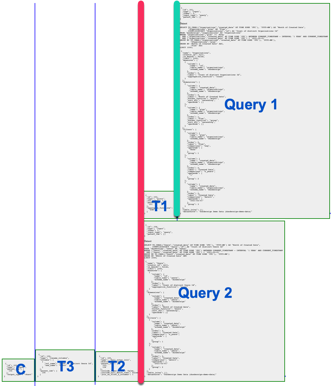
When you open the HTML file, you’ll see a block for each dashboard element. For example, we have the following dashboard with a Calendar Control, a Bar chart, and a Bar Line chart:
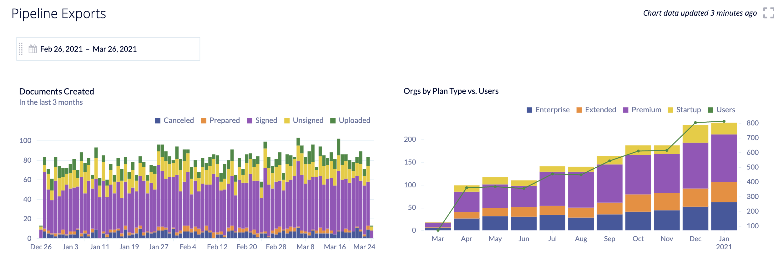
Here’s how this dashboard’s HTML file will look:
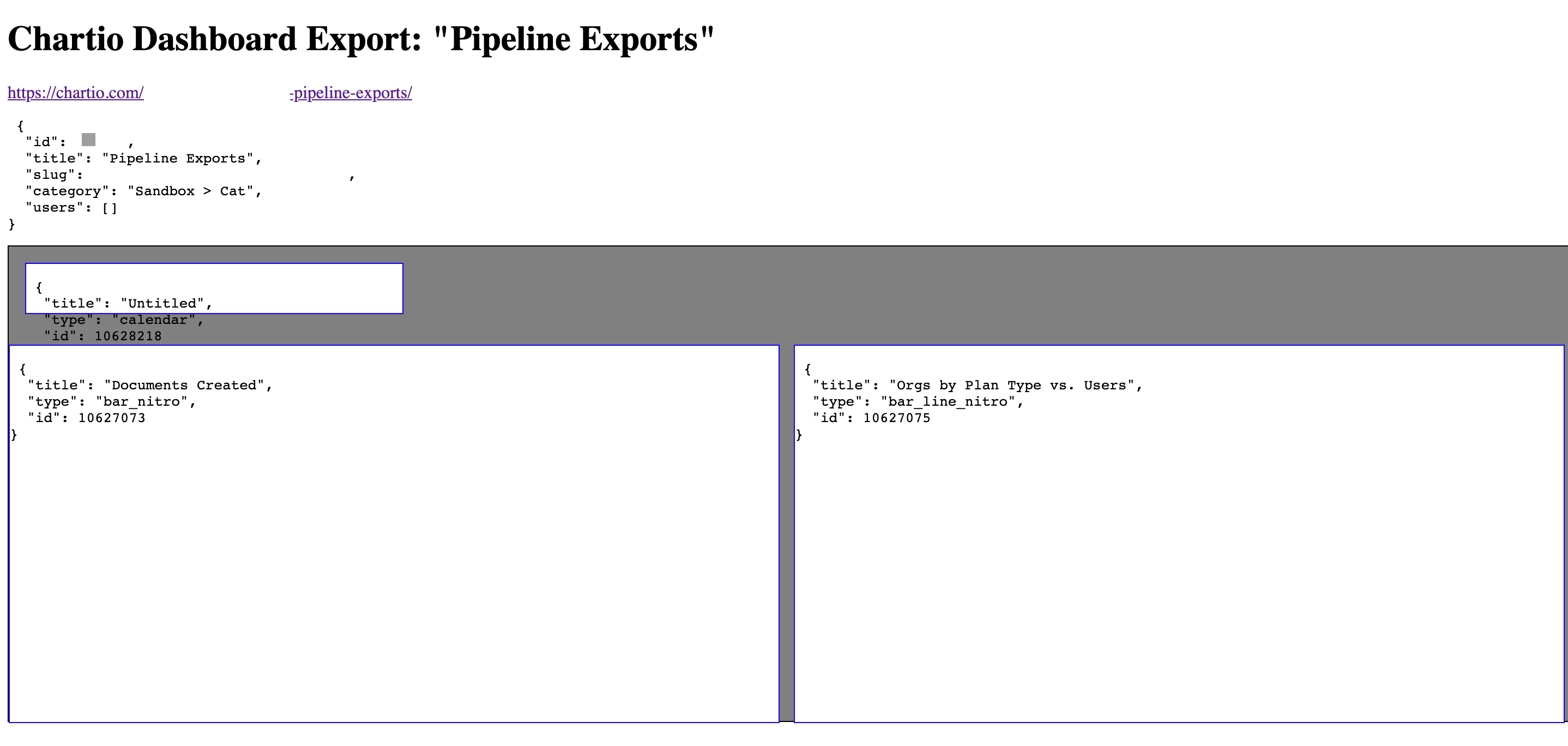
Click on any of the blocks to view its chart information and Pipeline data—all of which are shown as JSON objects.
Note: If you have overlapping dashboard elements, you may need to click the chart title or variable name to select it.
Before the Pipeline data, each element shows the following:
- Link to the dashboard
- Dashboard info (Id, title, slug, category, users with access)
- Chart metadata
- Chart settings (Keys in the settings object will differ depending on the chart type)
Reading the Pipeline data
At a glance, you’ll notice a number of blue vertical lines and a bunch of gray boxes. We highly recommend zooming out on the HTML file to get a more complete view of the pipeline layout so you can determine where to start. The file is best read from right to left, top to bottom. Find the upper rightmost box, and let that be your starting point for navigating the Pipeline data.
Each box contains a JSON object and represents a Query, transformation step (Visual SQL Action or Data Explorer Pipeline step), or chart. The chart output is always the leftmost box in the Pipeline data.
The JSON object contains fields (AKA keys) that will be particularly helpful for reading and navigating through the file:
id: the unique numeric identifier for the box in the file;type: indicator for what the box represents–inputfor queries, the step name for transformations, andoutputfor charts;parent_ids: list of box ids passing data to the current box; Join steps can have multiple parent_ids
Now that you know what each box means, how are they all connected?
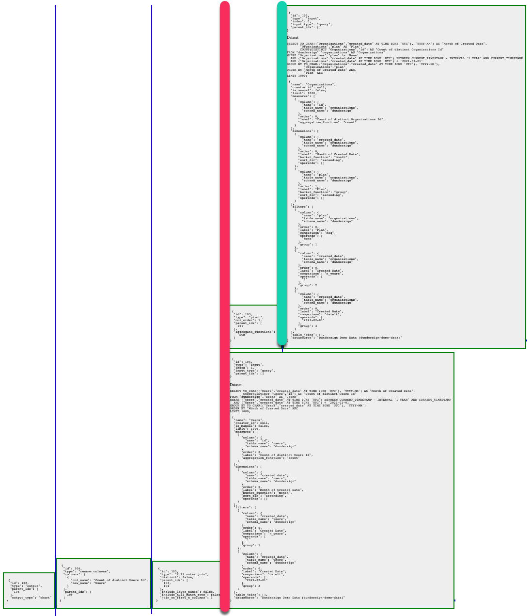
Boxes linked on the same horizontal path are a set of transformations performed on an initial dataset. In the example below, we’ve highlighted one set in green and the other set in red.
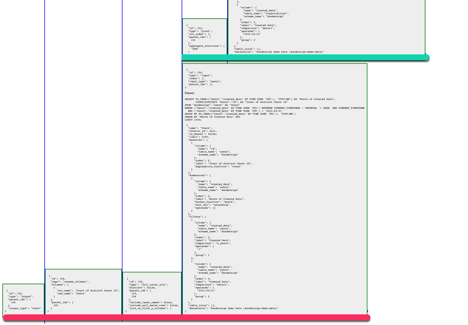
Boxes whose left side is adjacent to a vertical line are inputs for the box whose right side is adjacent to that same vertical line. Make sure to zoom in to see whether or not vertical lines are actually connected. In the example below, the green line has one input box, but the red line has two input boxes.
Check out our Advanced example below for a full explanation of how to read this Pipeline data example.
Basic example
Tip! Start with a few simple charts to orient yourself with the flow of the pipeline before progressing to your more advanced charts. After looking at a few files, you can navigate them like a pro.
We’ll get you started with a simple example. This chart was created using only one Query and one transformation step (Pivot).

The Pipeline data for this chart should show only three blocks: one for the Query, one for the transformation step, and one for the final chart. Here’s the actual output, which shows exactly what we’d expect:
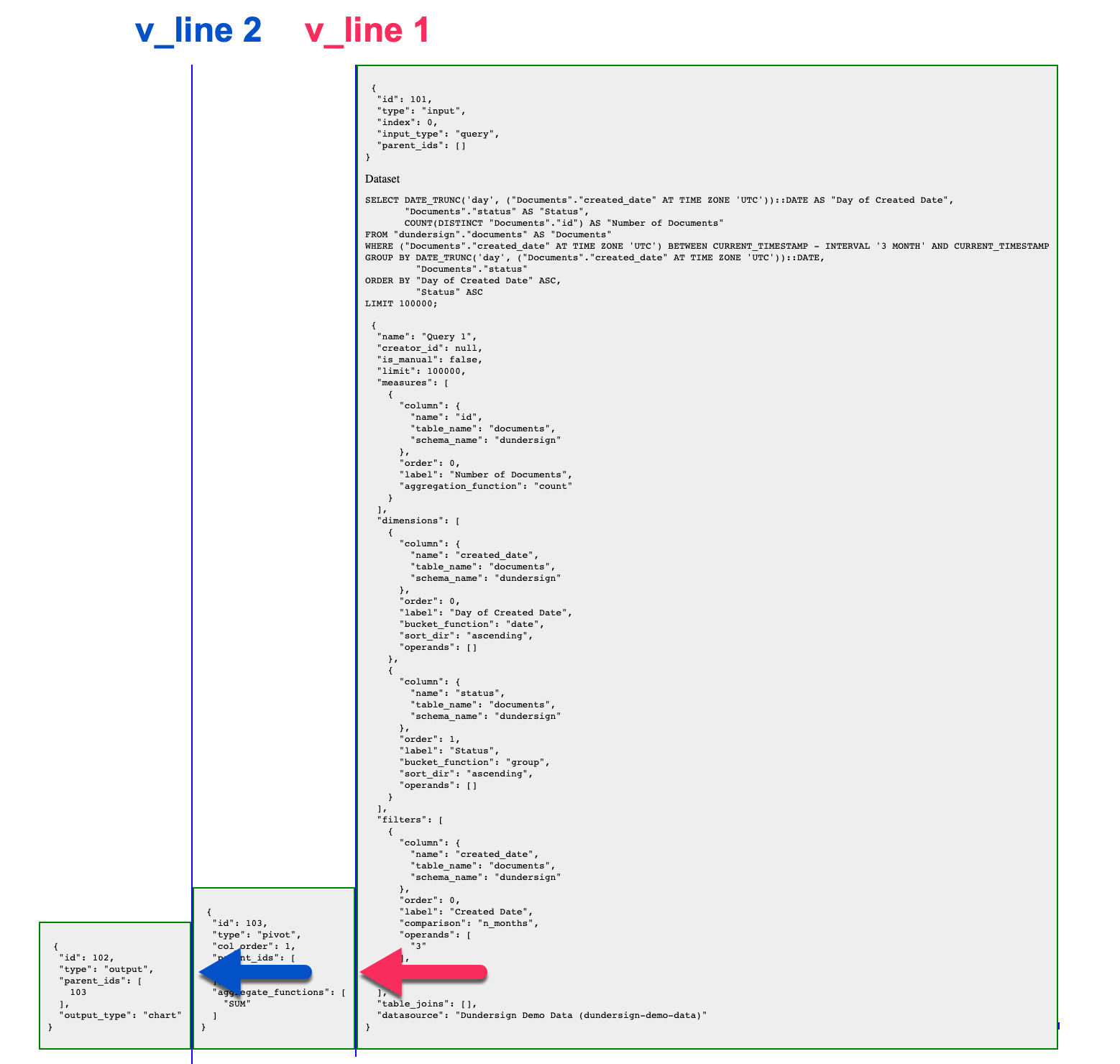
The rightmost box is the initial Query (and our starting point), the middle box is the transformation step, and the leftmost box is the chart.
- The Query box and the transformation step box are connected by the same vertical line (
v_line 1). The Query box’s left side is adjacent to that vertical line, which means the Query’s output is an input for the transformation step. - The transformation step box and the chart box are connected to the same vertical line (
v_line 2). The transformation step box’s left side is adjacent to that vertical line, which means the transformation step’s output is an input for the chart. - The chart uses the output of the transformation step to produce the visualization.
Advanced example
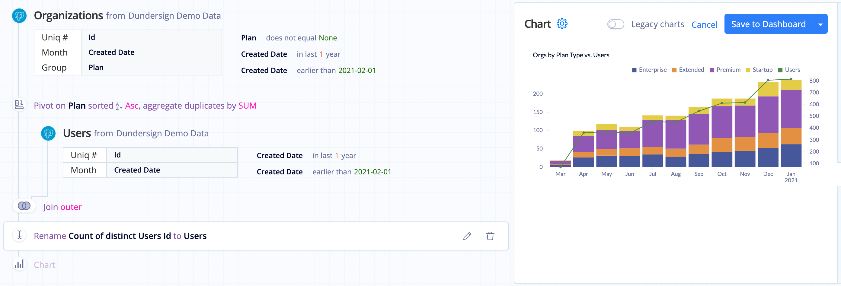
Now let’s cover a slightly more complex chart. It starts with an initial Query that has a single transformation step (Pivot) applied to it. The result set of that transformation step is then merged with the result set of a second Query using a Join step. The result set of that Join step then has a transformation step (Rename) applied to it.
The Pipeline data in the HTML file should show a total of six boxes: two for the Queries, three for the transformation steps (including the Join step), and one for the final chart. Here’s how it looks:
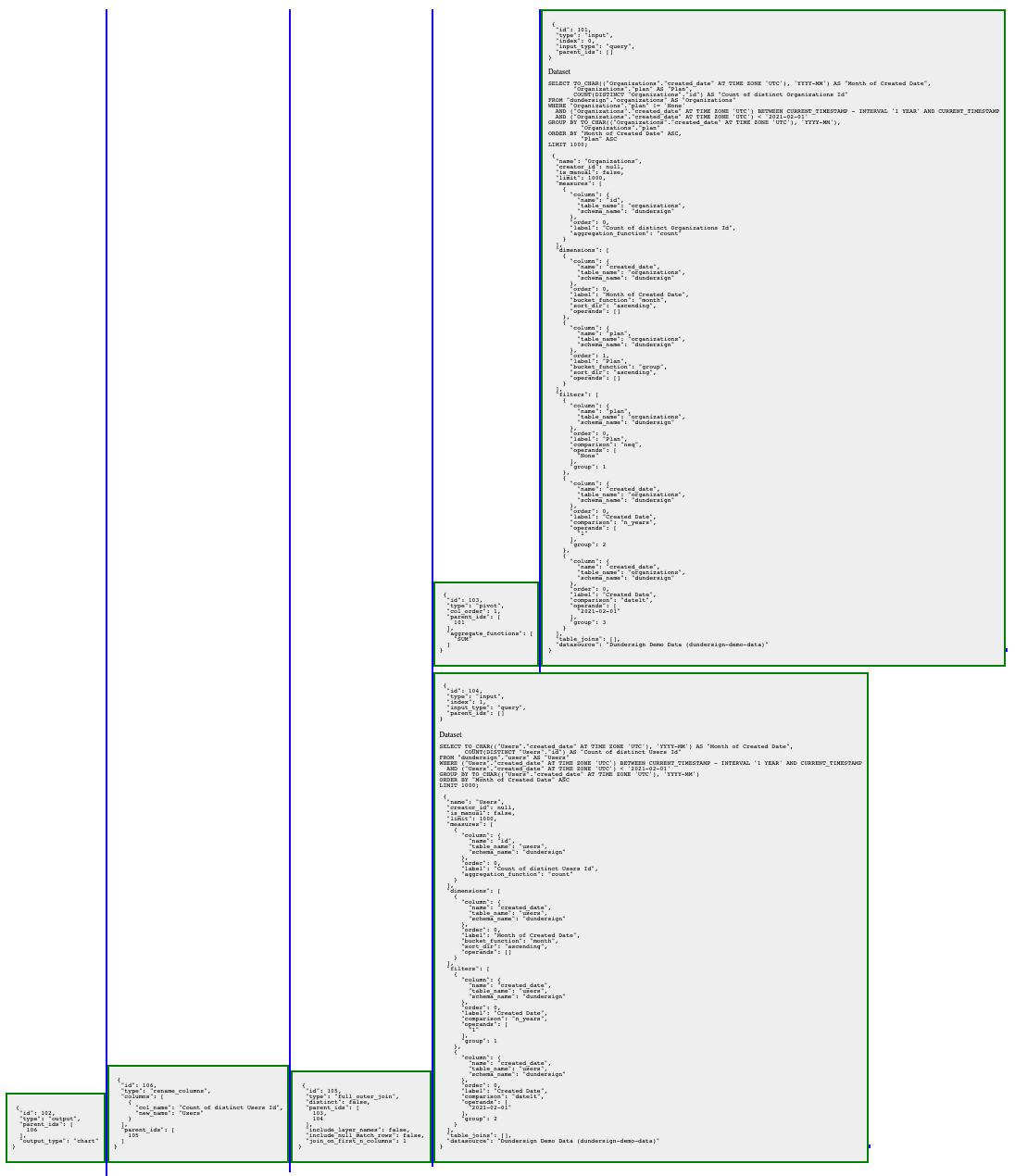
Query 1 is the upper rightmost box, so we’ll start there.
- Query 1 and T1 are connected to the same vertical line (shown in green). Query 1’s left side is adjacent to that vertical line, which means Query 1’s output is an input for T1.
- T1, Query 2, and T2 are connected to the same vertical line (shown in red). T1’s left side and Query 2’s left side are adjacent to that vertical line, which means each of their outputs are inputs for T2. Since Join steps are the only boxes that can have multiple inputs, we know that T2 corresponds to the Join step of the chart.
- T2 and T3 and connected to the same vertical line, which means T2’s output is an input for T3.
- The chart (C) uses T3’s output to produce the visualization.
Tip! For more complex charts, you may need to refer to the id and parent_ids of each box to help you determine how the boxes are connected.
