Data Pipeline Steps
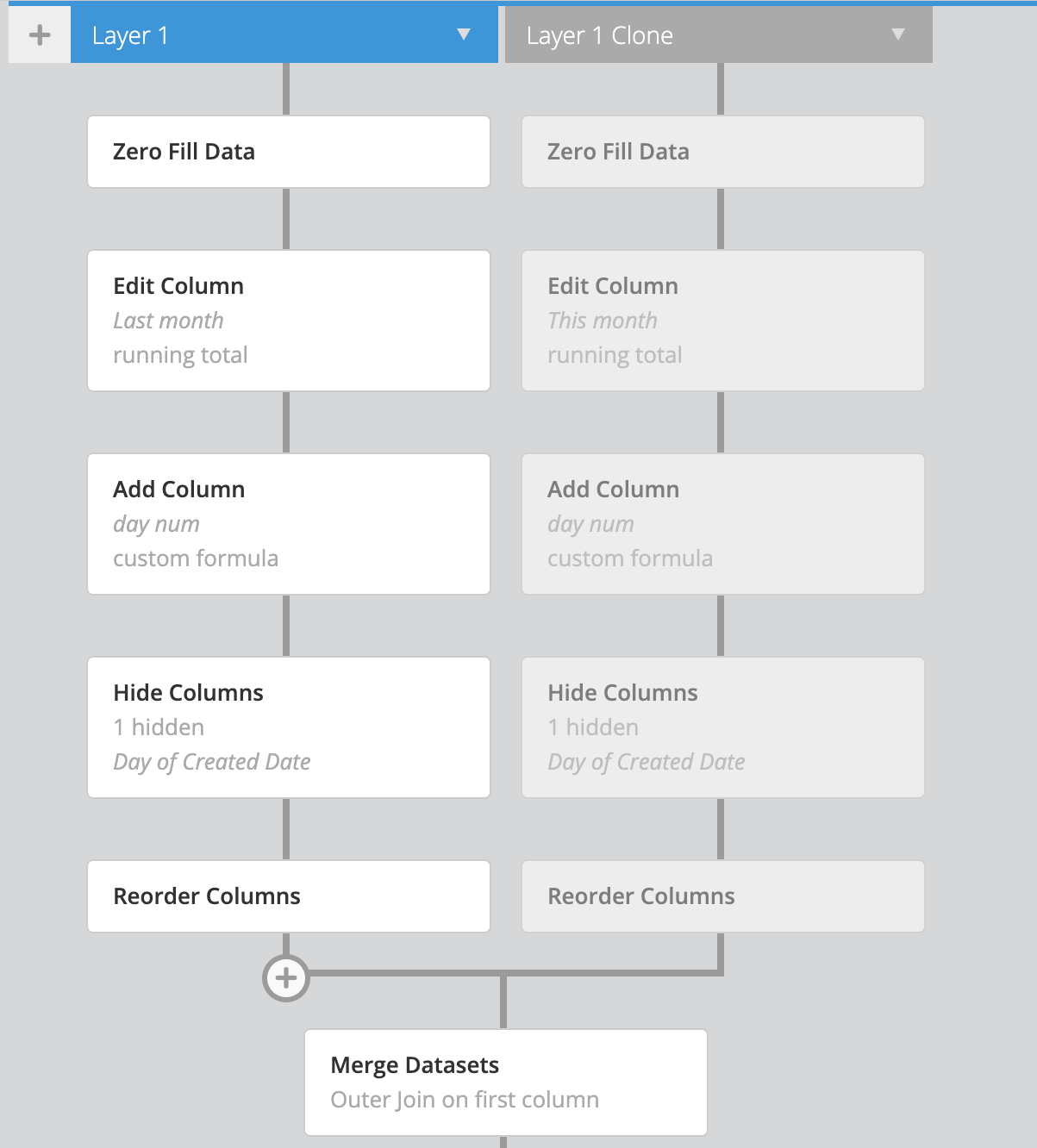
Data Pipeline Steps allow you to perform a variety of post-query manipulations in Chartio. Steps can be added to the pipeline under any dataset to edit the results of that specific dataset’s query. Steps can also be added after merging datasets to manipulate the merged data.
Add Column
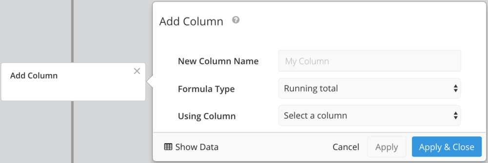
Add a calculated column to your query results. Use one of our built-in functions, or choose Custom Formula in the Formula Type dropdown to create your own. See Formulas to view some examples of functions you can use.
Bucket Data
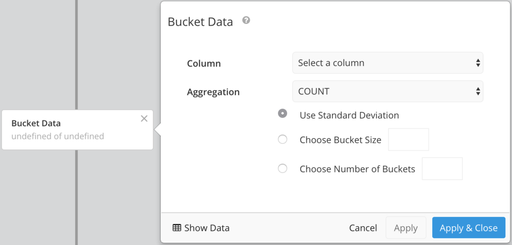
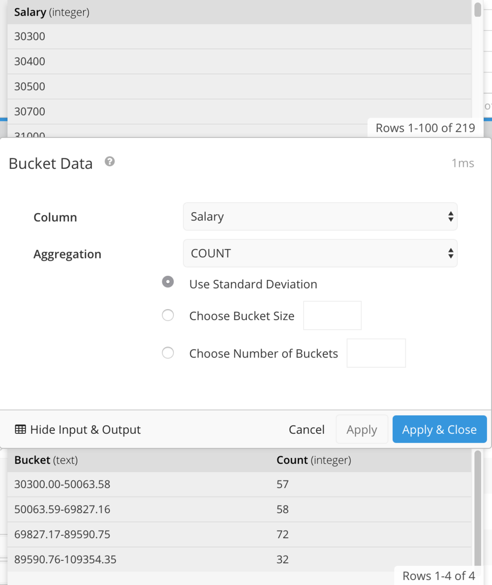
The Bucket Data pipeline step divides the values from one column into a series of ranges, and then counts how many values fall within each range. This data format can be used to create a histogram chart.
Histograms generally use COUNT as the Aggregation, but you may also choose MIN, MAX, SUM, or AVERAGE.
Define your buckets using any of the following options: Standard Deviation, Bucket Size (amount in each range), Number of Buckets, or Custom to choose custom ranges.
Bucket Data Example
Case Statement
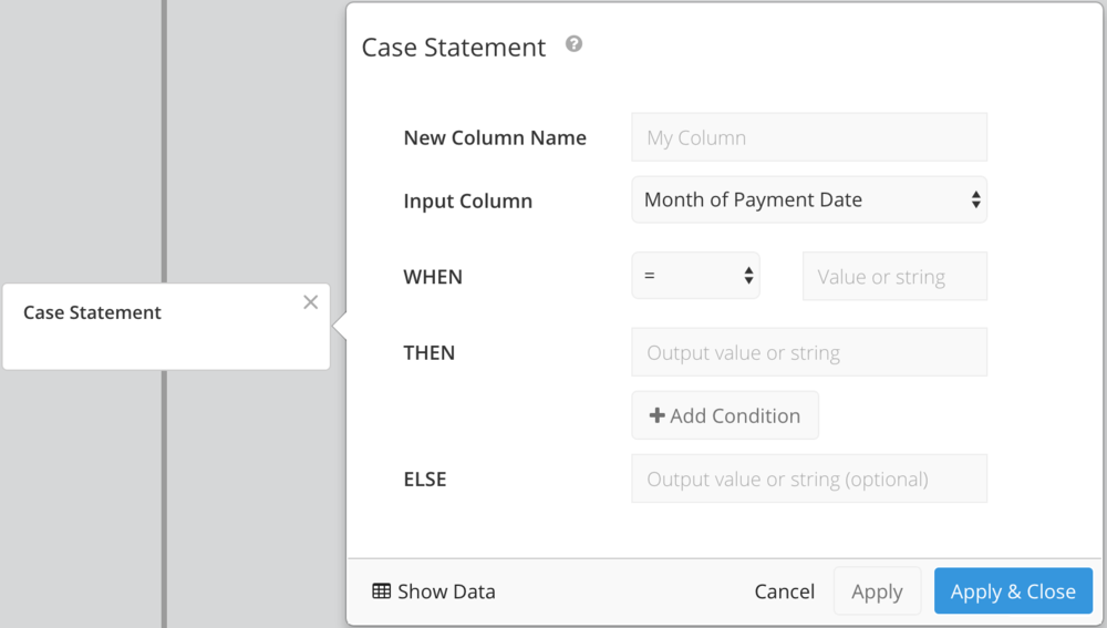
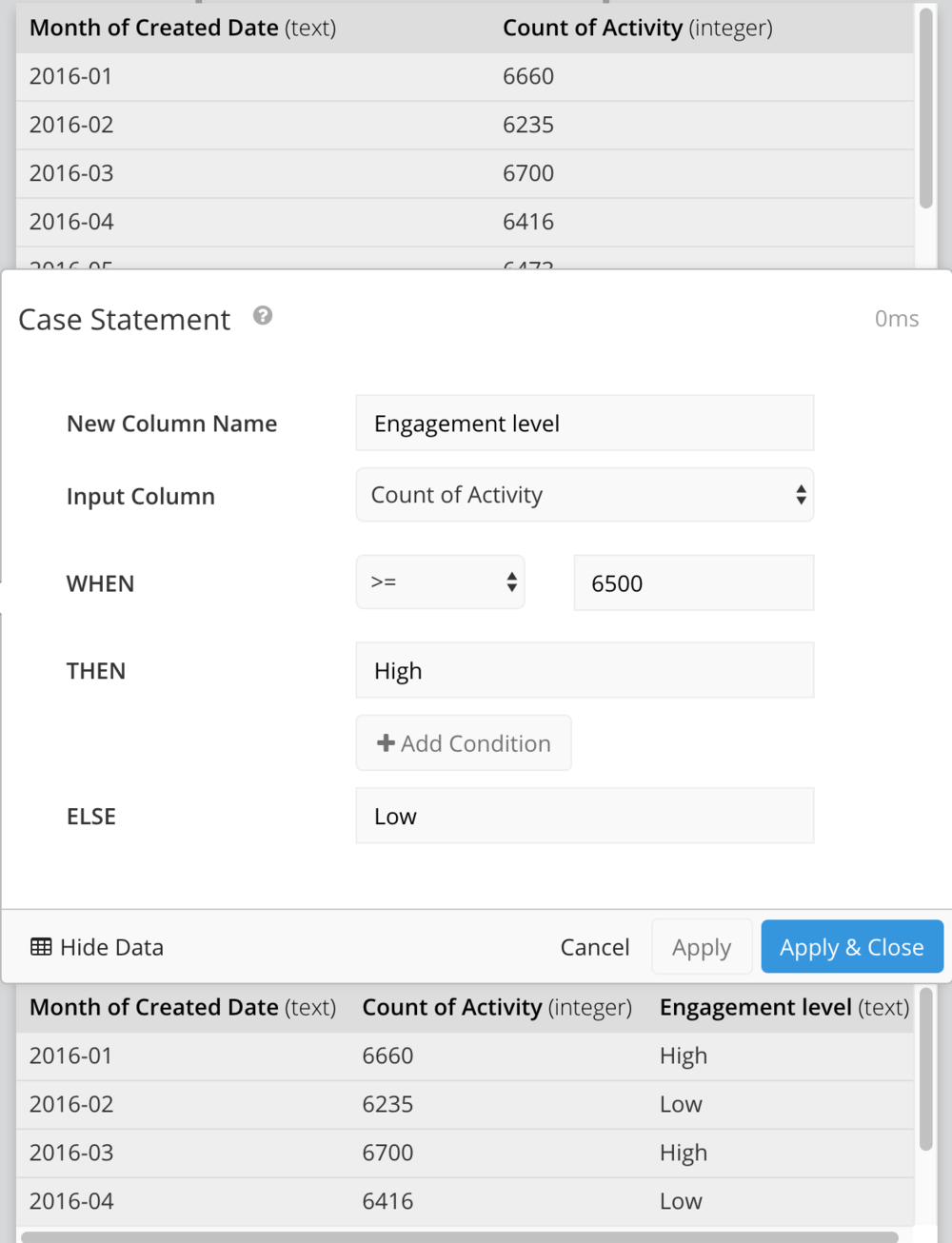
Add a column to your query results (or edit an existing column) where values are set based on certain “if… then” conditions.
Dashboard Controls can be used in any part of a Case Statement pipeline step.
Note: If you find that you use the same CASE statement across multiple charts, you may want to consider putting the generated column data into a Data Store or a custom column in your database.

To pass through column values in THEN or ELSE, select Column from the dropdown and choose your column.
Case Statement Example
Combine Columns
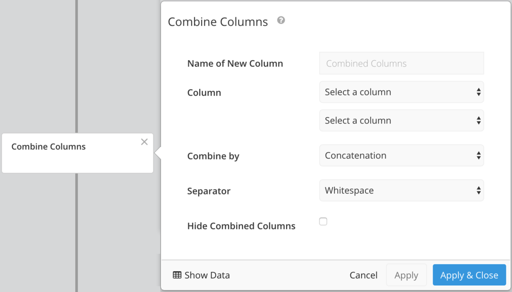
Combine columns either by applying a mathematical operation or by concatenation. Check the Hide Combined Columns checkbox to hide your original columns.
Edit Column
Use this step to edit an existing column. All column types (text, date, number, etc.) allow entering a custom formula, and numerical columns have additional formula types including simple math operations and rounding.
Extrapolate Data
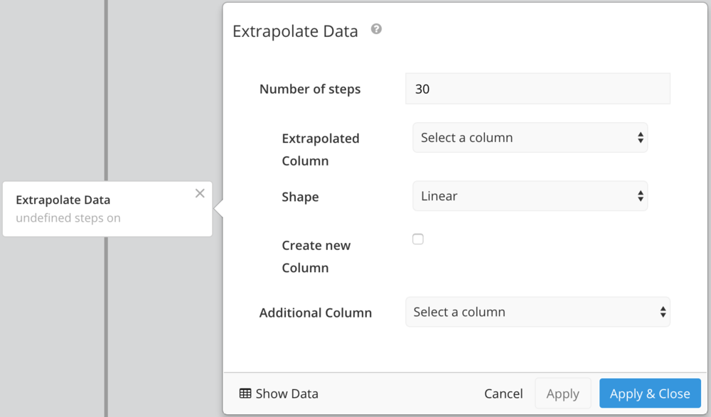
The Extrapolate Data step provides predictive data for a column in your query results. Choose whether to add data to the existing column or create a new one, the number of rows returned, and the type of extrapolation used (Cubic, Quadratic, or Linear).
Filter Rows
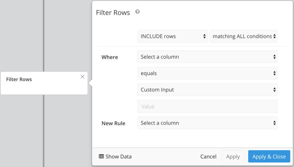
Filter rows on certain conditions. Choose Include or Exclude, then choose:
- Matching all conditions
Uses AND logic. Row will be included or excluded only if it matches every condition. - Matching any conditions
Uses OR logic. Row will be included or excluded if it matches one or more conditions.
Regular Expression Matching
Any text column supports filtering by Java-style regular expressions in the Filter Rows Pipeline step. Matching is case-sensitive and unicode-aware by default. For case-insensitive matching, add (?i) to the beginning of your regular expression.
For examples of ways to use the Filter Rows Pipeline step, check out our FAQ: Filter Rows examples.
Group Rows
Group step works the same as GROUP BY in SQL. It allows you to group your query results based on a certain column. You’ll need to choose which column you want your chart to be grouped by, and which aggregation you would like for the other columns. Aggregation types include SUM, AVG, CONCATENATE (comma-separated list), COUNT, COUNT DISTINCT, MAX, and MIN.
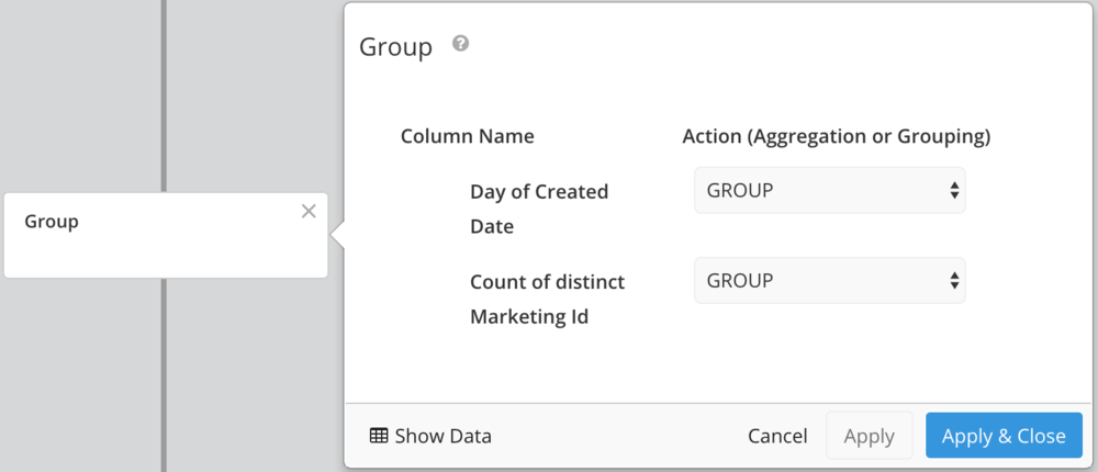
Group Step Example
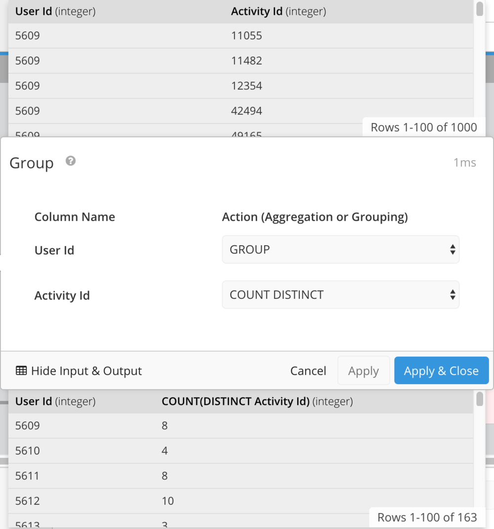
Hide Columns
Hide one or more columns in your query results. If you need to use hidden columns in a Formula, hide the columns as the last step.

Limit Rows
Limit the number of rows included in your query results. Can be useful when applied after a sort—for example, sort sales descending and limit 10 to include the top 10 sales. Offset allows you to select a specific range of rows. For example, to include only rows 10-30, set the limit to 20 and the offset to 10.

Pivot Data
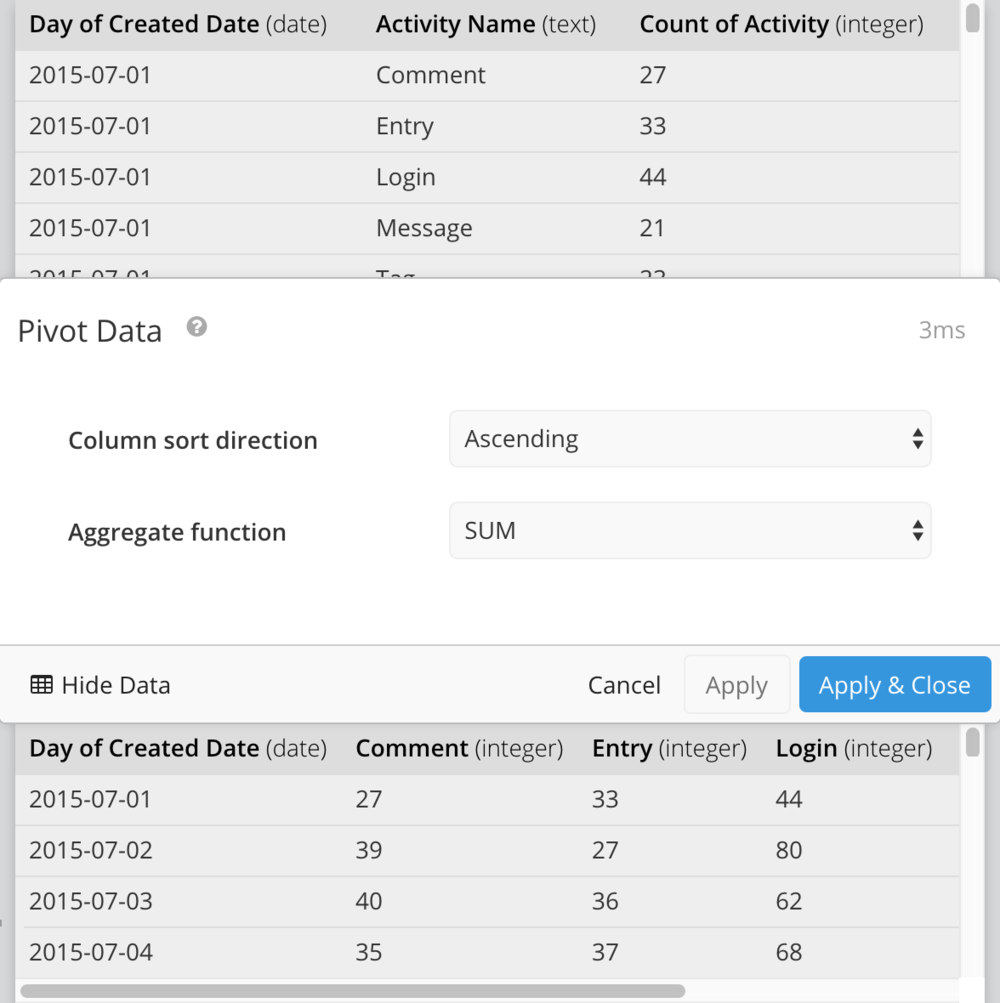
If your chart has one measure grouped by two dimensions, such as count of activity grouped by month and by activity type, you’ll want to pivot the data so you can use it in a chart.
Pivot tables require 3 columns. Your data is pivoted on the second column—e.g., the second column becomes the column headers.
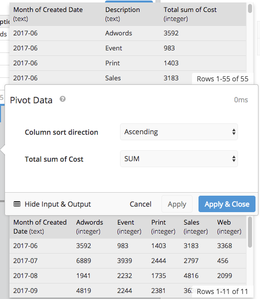
Select Ascending, Descending, or None in the Column sort direction dropdown to customize the column order in your pivot table. Aggregate Function allows you to choose the aggregation for duplicate group values. Available aggregations are: SUM, AVG, MIN, MAX, GROUP_CONCAT, and Auto. Auto will choose either SUM or GROUP_CONCAT, depending on the data type.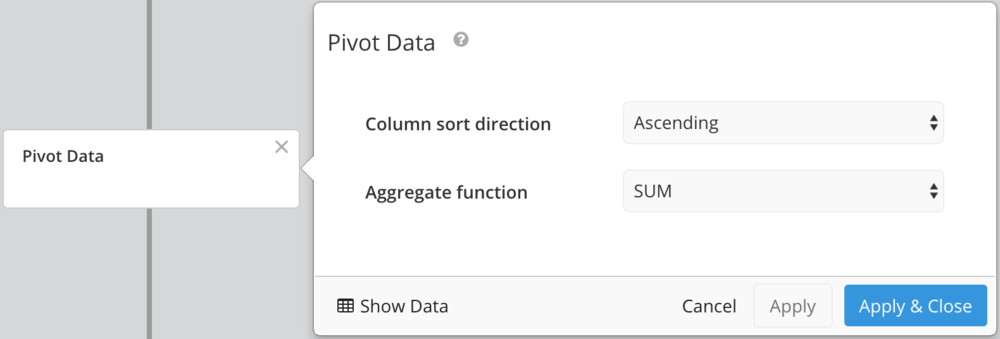
For more information on how to use the Pivot Data Step, please see our tutorial on How to Pivot a Table.
To pivot on more than 3 columns, refer to Pivot on more than 3 columns.
Pivot Data Example
Rename Columns
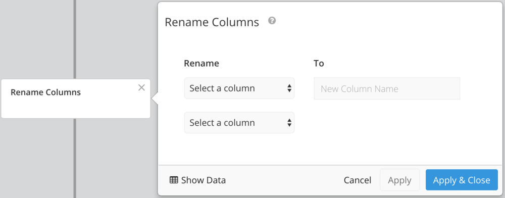
Rename one or more columns. Useful for display purposes, or shortening column names for ease of use in formulas.
Reorder Columns
Easily click and drag your column names to reorder how they will appear in your chart. Note: It’s generally best to reorder columns in one of the last steps, as any editing that involves column changes will affect your reordering settings.

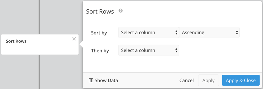
Sort Rows
Apply a sort to one or more columns.
Transpose
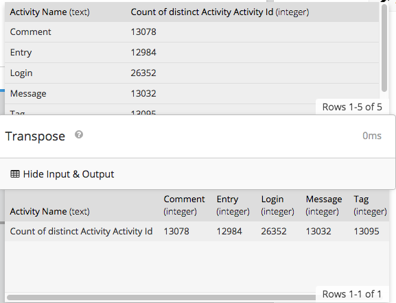
The Transpose step simply switches rows and columns.
There are no limits on the input table format, but the resulting table cannot contain more than 1000 columns.

Transpose Data Example
Unpivot Data
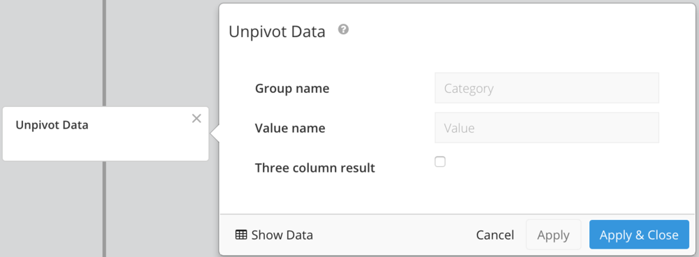
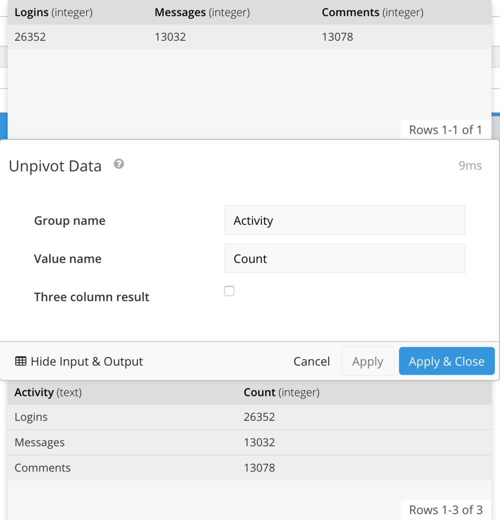
Unpivot data is useful when you have multiple single value columns that you want to use in a visualization, such as a pie, line, or bar chart.
If each layer returns a single value, choose Cross Join as your merge type.
Unpivot Data Example
Zero Fill Data
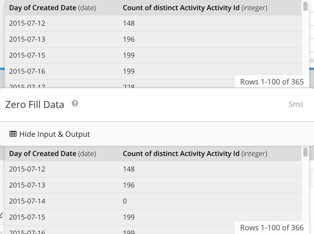
Zero fill fills in missing values in your data with zeros. It’s important when charting a time series with missing dates, or when performing calculations on columns that contain NULL values.
Note: Zero-fill will fill in all date and numeric columns in your query results.

Zero Fill Example
