Chart Settings (Vega)
Have questions about our new visualizations? Also check out our New Visualizations FAQ!
Each chart type has its own customizable chart settings. The settings are grouped into different tabs, but not all chart types have every settings tab.
You can get to the Chart Settings via one of the following methods:
- From the dashboard, open the chart’s ellipsis menu and click Edit Settings
- In Visual SQL, click the Gear above the Chart Preview.
- In Data Explorer, click Settings next to the chart title.

Chart settings tabs
| General | Legend | Axis | Color |
| Series | Drilldown | Annotation |
Settings for each chart type
| Area | Bar | Bar Line | Box Plot |
| Bubble Map | Bubble | Bullet* | Funnel* |
| Heat Map | Line | Map | Pie |
| Scatter Plot | Single Value* | Single Value Indicator* | Sparkline |
| Table* |
General
Applicable chart types: All
Listed below are some common fields found in almost every chart type’s General settings tab. Fields for a specific chart type can be found on the chart type’s settings page.
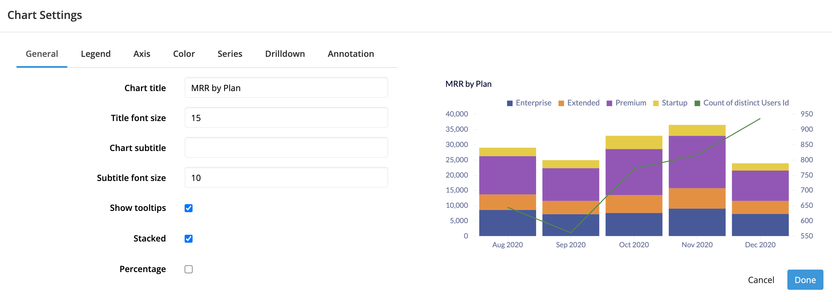
- Chart title
- The title of your chart
- Title font size
- The font size of your chart title; minimum value is 8
- Chart subtitle
- The subtitle for your chart
- Subtitle font size
- The font size of your chart subtitle; minimum value is 8
- Show tooltips
- Enable tooltips, which appear when you hover over areas of your chart and show the values at the specified point
Legend
Applicable chart types: Area, Bar, Bar Line, Bubble, Heat Map, Line, Pie, Scatter Plot
Listed below are some common fields found in almost every chart type’s Legend settings tab. Fields for a specific chart type can be found on the chart type’s settings page.
- Show legend
- By default, all charts display a legend if there are multiple groupings in your chart. You can change this via the Show legend dropdown in the General tab of the settings. The following options are available:
- Always: the legend always appears on the chart
- Never: the legend is hidden from the chart
- Auto: the legend appears when multiple groupings are present
- Placement
- If the chart legend is shown, choose whether to display the legend outside or inside the chart and where to place it
-
Outside Chart:
- Left
- Right
- Above (default)
- Below
-
Inside Chart:
- Top Left
- Top Right
- Bottom Left
- Bottom Right
- Number of columns
- Specify the number of columns your legend spans; leaving the default as
0keeps your legend on one line
Axis
Applicable chart types: All except Bubble Map, Map, Pie, Single Value, Single Value Indicator, and Table
Listed below are some common fields found in almost every chart type’s Axis settings tab. Fields for a specific chart type can be found on the chart type’s settings page.
X Axis
- Title
- Title for the x-axis
- Rotate labels
- Rotate the x-axis labels by -45, -30, 30, or 45 degrees—or don’t rotate them at all
-
Another way to work with long label names is to use angled or rotated labels. This is great for situations when you can’t (or don’t want to) swap the axes of your chart, or when you have long labels on both axes. If you aren’t hiding your labels, you can avoid the ellipsis labels by rotating them. Angled labels will get harder to read the more they are rotated, so only angle them as much as is needed.
- Hide labels
- When selected, hides the x-axis labels
- Min
- Available when the x-axis labels are numeric
-
Specify the minimum value of your y-axis
- Max
- Available when the x-axis labels are numeric
-
Specify the maximum value of your y-axis
- Steps
- Available when the x-axis labels are numeric
-
Specify the number of steps to show between your Min and Max values
- Date format
- Available when the x-axis labels are dates
-
Choose how to format date labels:
- Short (mm/dd/yy; e.g., 3/28/19)
- Medium (e.g., Mar 28, 2019)
- Long (e.g., March 28, 2019)
- Full (e.g., Thursday, March 28, 2019)
- ISO-8601 (e.g.,
2019-03-28)
Check out our FAQ about X-axis date labels if you’re having issues.
- Data format
- Available when the x-axis labels are numeric
-
Choose how your values are displayed
- Number
- Percentage: Multiplies the values by 100 and appends a
% - Currency
- None (no format)
- Custom
- Number format
- Available when Data format is Number
-
Choose how your numbers are displayed
- 1,234.56
- 1234.56
- 1234,56
- 1.234,56
- 1 234,56
- 1’234.56
- Currency format
- Available when Data format is Currency
-
Choose a currency symbol to prepend to your axis labels
- $ (USD)
- € (EUR)
- ¥ (JPY)
- £ (GBP)
- ₪ (ILS)
- R$ (BRL)
- Rounding
- Available when Data format is Number or Currency
-
Choose how to round your values—or don’t round
- 1k
- No Rounding
- Round to Integers (1000)
- 2 decimal places
- 3 decimal places
-
Note: If your chart values are integers, labels will be integers too.
Y Axis
- Title
- Title for the y-axis
- Hide labels
- When selected, hides the y-axis labels
- Rotate labels
- Rotate the y-axis labels by -45, -30, 30, or 45 degrees—or don’t rotate them at all
- Min
- Specify the minimum value of your y-axis
- Max
- Specify the maximum value of your y-axis
- Steps
- Specify the number of steps to show between your Min and Max values
- Data format
- Choose how your values are displayed (see Data format from the X Axis section for more details)
- Number format
- Available when Data format is Number
-
Choose how your numbers are displayed (see Number format from the X Axis section for more details)
- Currency format
- Choose a currency symbol to prepend to your axis labels (see Currency format from the X Axis section for more details)
- Rounding
- Available when Data format is Number or Currency
-
Choose how to round your values—or don’t round (see Rounding from the X Axis section for more details)
Color
Applicable chart types: All
Listed below are some common fields found in almost every chart type’s Color settings tab. Fields for a specific chart type can be found on the chart type’s settings page.
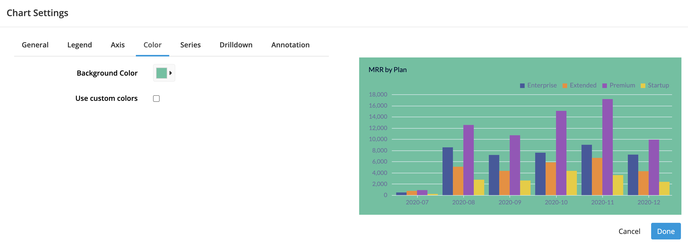
- Background color
- The background color of your chart
-
By default, uses the background color of the Dashboard Theme; selecting another color overrides background color of the dashboard theme
-

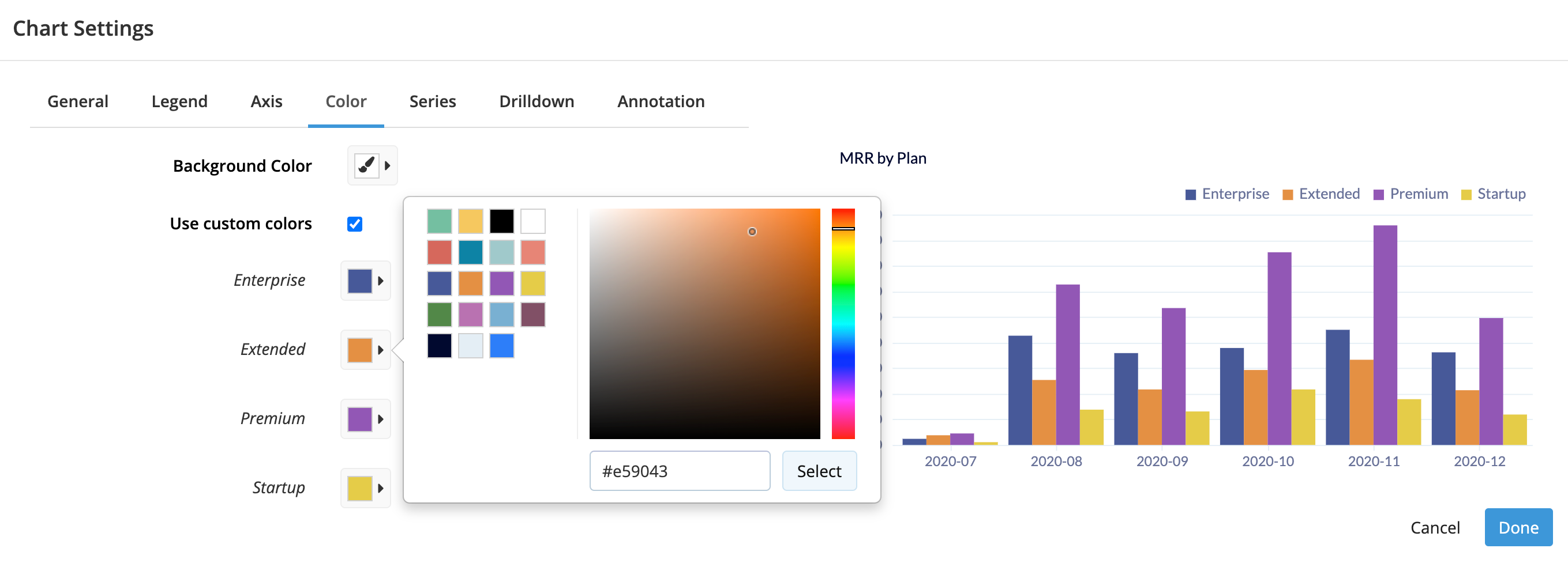
- Use custom colors
- Select to override the colors of the dashboard theme
-
Use the color picker to set the color of each column represented on your chart. You could also input the hexadecimal color code if you’d prefer. Make sure to click Select once you’ve chosen your color to update the selection.
-
The colors are tied to each specific result set in your chart, so if the ordering in your chart changes due to the data changing, the color you associated with Login, for example, always stays associated with Login. However, the color resets if you change the name of Login.
-

Series
Applicable chart types: All except Box Plot, Bullet, Funnel, Pie, Single Value, Single Value Indicator, and Table
Drilldown
Applicable chart types: All except Sparkline
Turn your chart into a Drilldown by selecting the dashboard and Dashboard Controls to connect it to.
Annotation
Applicable chart types: All except Bubble Map, Bullet, Map, Pie, Single Value, Single Value Indicator, Sparkline, and Table
Add a note at a specific x or y-axis value in your chart to provide your teammates with some context for the data or add a target line to your chart.
- Show annotation labels on chart
- Select to show the Label you provide when adding a new annotation
Add a new annotation
Click Add new annotation to create a new annotation.
- Axis
- Choose to add an annotation at a value on the X Axis or the Y Axis
- Value
- Specify the value on the chosen axis to show the annotation; the sample values below the form field show the required format
- Label
- The note you’d like to add; appears next to the annotation line
- Color
- Choose the color of the annotation (for both the line and text)

