Quick Start - Data Explorer
New to Chartio? We know documentation can be a bit daunting, so we’ve highlighted some topics to help you get started.
Access to Chartio
Sign up for a free trial or log in at chartio.com.
Connect to data
Chartio is a data visualization tool, so the first step would be to find some data. To add data to your Chartio account, navigate to the Data tab from the top menu. From there you can:
- Connect your database to Chartio. Chartio will need read-only access to your database. You can find more information in our instructions for connecting a data source.
- Connect a Google Sheet or upload a CSV file from your computer. If you aren’t quite ready to connect your database, you can start to leverage Chartio to gain insights from those spreadsheets on your local machine.
- Use our demo data sources to start learning Chartio. The value of Chartio is best realized when visualizing your own data but the demo sources are a quick way to get started.
- Use the data sources to which you’ve been granted access. If you are joining an existing Chartio account, there is a good chance that your data is already connected. If all data sources are listed as unauthorized in the Data Sources tab, you may need to reach out to an Owner on your Chartio account to be granted the proper permissions.
Open the Data Explorer
Once you have some data, it’s time to get started! There are several ways to open the Data Explorer to create charts in Chartio. For this guide, we’ll access it from the top navigation bar by clicking the Chart tab. You can access this tab from any page within Chartio to quickly analyze data without the need to save it to a specific dashboard.

Create a chart
Chartio’s Data Explorer interface makes it easy to get up and running quickly and start getting insights from your data. This guide will walk you through the steps to create your first chart. No SQL knowledge required.
Save results to a dashboard
Charts and tables in Chartio are organized on dashboards which can be easily created, updated, and shared. When you have finished creating your chart, click Save to Dashboard in the upper right of the Data Explorer and you’ll be provided options to save your chart to an existing dashboard or create a new dashboard.
Share with colleagues
Don’t keep it a secret! Chartio has several options to share your work:
- Add colleagues to your Chartio organization.
- Create a scheduled email report of your dashboard to be emailed to recipients of your choice, regardless of whether they are a Chartio user.
- Share your charts in your Slack channels.
Create a chart
Once your data is brought into Chartio, you can easily start creating charts using our drag-and-drop interface.
Here’s a quick example showing how to calculate the total amount of payments by month using our Chartio Demo data source:
Creating a basic chart
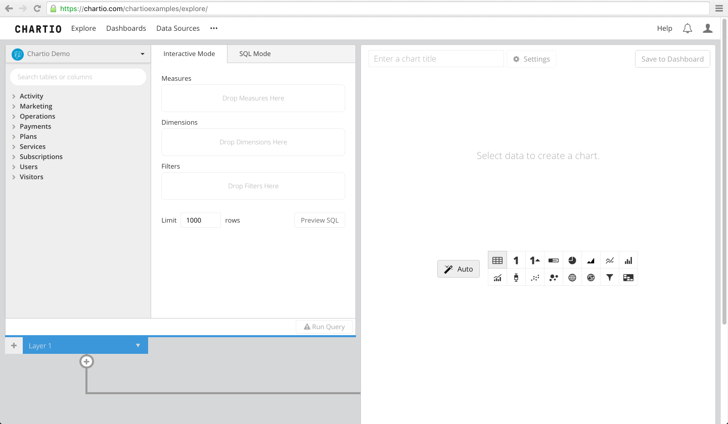
From the top navigation, click Chart to open the Data Explorer.
The other path to the Data Explorer is through an existing Dashboard. From the Dashboards dropdown in the top navigation, select + New Dashboard or select an existing Dashboard. From the Dashboard sidebar, click Add Chart.
- Select your data source from the top-left dropdown
- Drag a Dimension (such as Date or Category) to Dimensions
- Drag a Measure (such as ID or Payments) to Measures
- Click Run Query
- Change chart type (optional)
- Add chart title (optional)
- Customize chart settings (optional)
- Click Save to Dashboard and choose a Dashboard from the pop-up or create a new one
Measures and Dimensions
Charts are made up of Measures and Dimensions. Dimensions are the grouped value, such as Category or Date. Measures are the aggregated value, such as Count of ID or Sum of Payments.
Learn more about Measures and Dimensions

Datasets
Datasets are where you build your queries. They let you select and modify the data you wish to visualize. To combine data from multiple data sources, query each data source in a separate dataset in the same chart.
Learn more about Datasets and joining Datasets

Data Pipeline
If you need to make any changes to your data results before you put them into a chart, the Data Pipeline can be incredibly useful. Filter or group your data, add calculated columns, and more.
To view a list of available Data Pipeline steps and instructions for how to add them, see our Data Pipeline documentation.
Learn more about the Data Pipeline
Chart types
Chartio offers many useful chart types. Some chart types require specific column formatting and data types. To view our chart types and the format required for each, please see our Chart Type documentation.

Advanced
Foreign keys
If you’d like to make a chart with data from multiple tables in a database, you’ll need foreign keys in your schema. Foreign keys tell Chartio how to combine multiple tables together in one query (dataset). When building your query, you’ll know if foreign keys are not set up when a table you want to use is disabled in Interactive Mode.
Dashboard Controls
Dashboard Controls allow you to dynamically filter multiple charts at a time using a dashboard widget such as a Dropdown or a Text Input.
Learn more about Dashboard Controls
Drilldowns
Chartio’s Drilldown functionality allows you to click an area on a chart to update a Dashboard Control value. The Dashboard Control then updates any charts that are connected to it.