Range Input example
Chartio has multiple Dashboard Controls that can be used to filter your chart data, such as a Range Input, which can help you filter your charts by a numeric range. This Control can be used in various types of charts.
For this example, we’ll use the Range Input to filter results on a Map chart. The Map below shows meteorite hits across the world (data courtesy of NASA).

There is a large range in the mass of the meteorites, ranging from 0.1 grams to 3,000,000 grams. To view areas within a more specific range, you can filter out some of the data using a Range Input as a filter on your dashboard.
From your dashboard’s side menu, click Add Control and select Range Input from the options.

A modal will pop up for you to customize your variable settings.
Select the desired Min and Max for your range.
Next, edit the Precision if you would like to include all values or if you would like to bucket the range input values. For example, using a precision of 5 will allow you to select range values in increments of 5. Here, we want all values so we’ll set our range input to the lowest precision option of 1.
Finally, set the range for the Default values that will be selected when the dashboard is first loaded. Click Ok.

Upon saving, place the newly created Range Input anywhere on your dashboard.
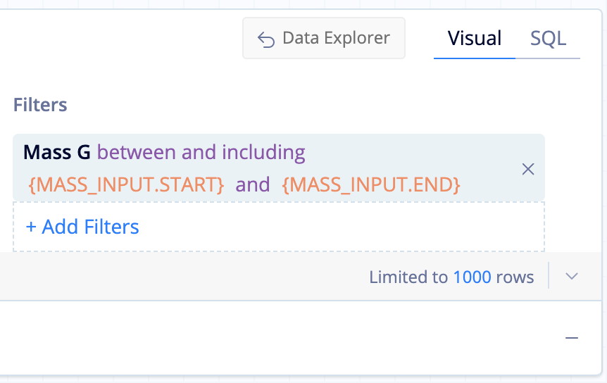
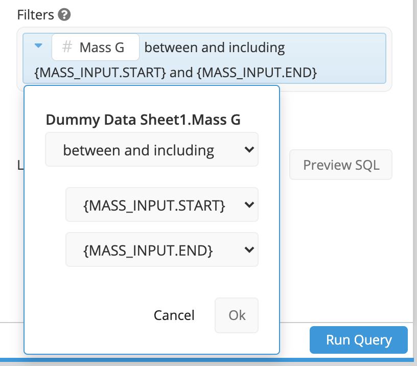
Next, you’ll need to set this as a filter in your chart(s) to connect your chart to the Range Input. Open your chart by clicking Edit Chart Data from the chart’s ellipsis menu. Then add the column with the range you’d like to use as a filter to the Filters box.
Set the filter to between and including and use {RANGE_INPUT_NAME.START} and {RANGE_INPUT_NAME.END} for the start and end dates, respectively. Replace RANGE_INPUT_NAME with the name of your Range Input Control.
| In the Visual SQL interface |
|---|
 |
| In the Data Explorer interface |
|---|
 |
Run your query and save your chart.
Your chart will now dynamically filter according to the range’s selection. Adjust the start and end of the range by dragging the start and end circle on your control on the dashboard.
