Bar Chart Settings
| General | Axis | Color |
| Series | Drilldown | Annotation |
General
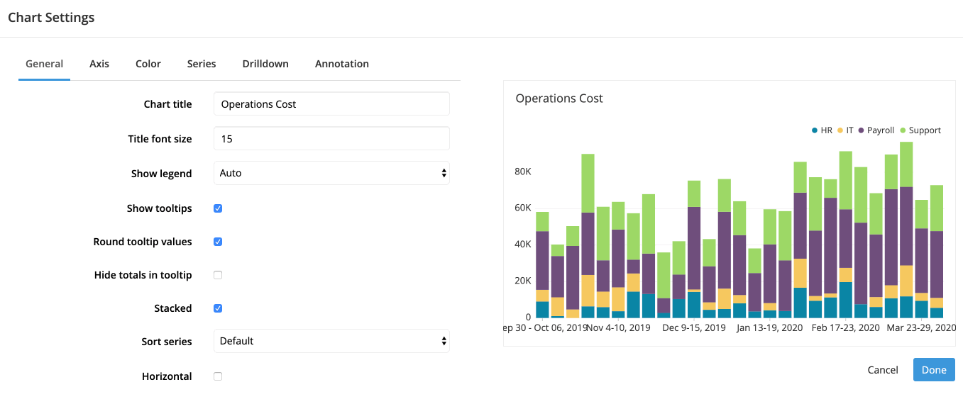
“Chart title”, “Title font size”, “Show legend”, “Show tooltips”, and “Round tooltip values” can be found in the General section of our Chart Settings page.
- Hide totals in tooltip
- Available when Show tooltips is selected
-
When selected, it hides the Total value, which is only displayed when Stacked is selected
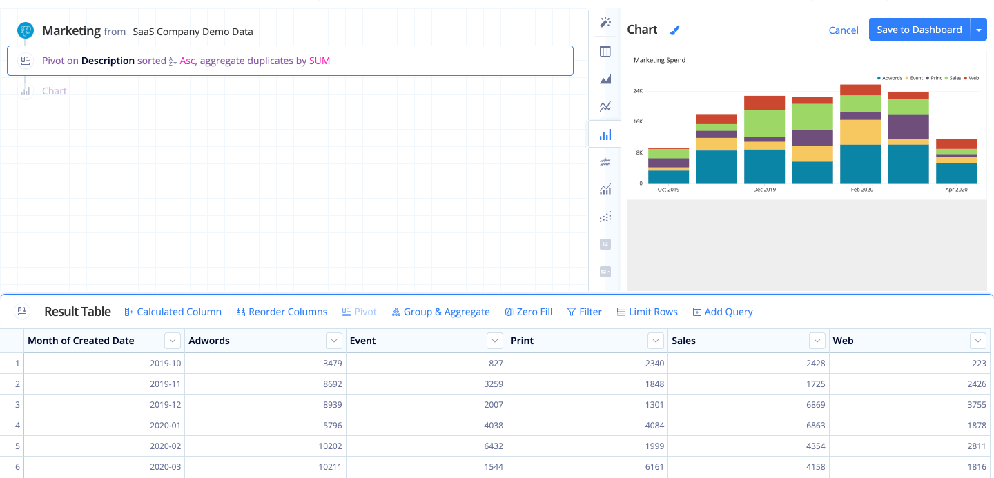
- Stacked
- When selected, stacks each Bar layer.
-
Stacked Bar charts work best when you want to focus on overall total values but still want the components to be visible.
-

-
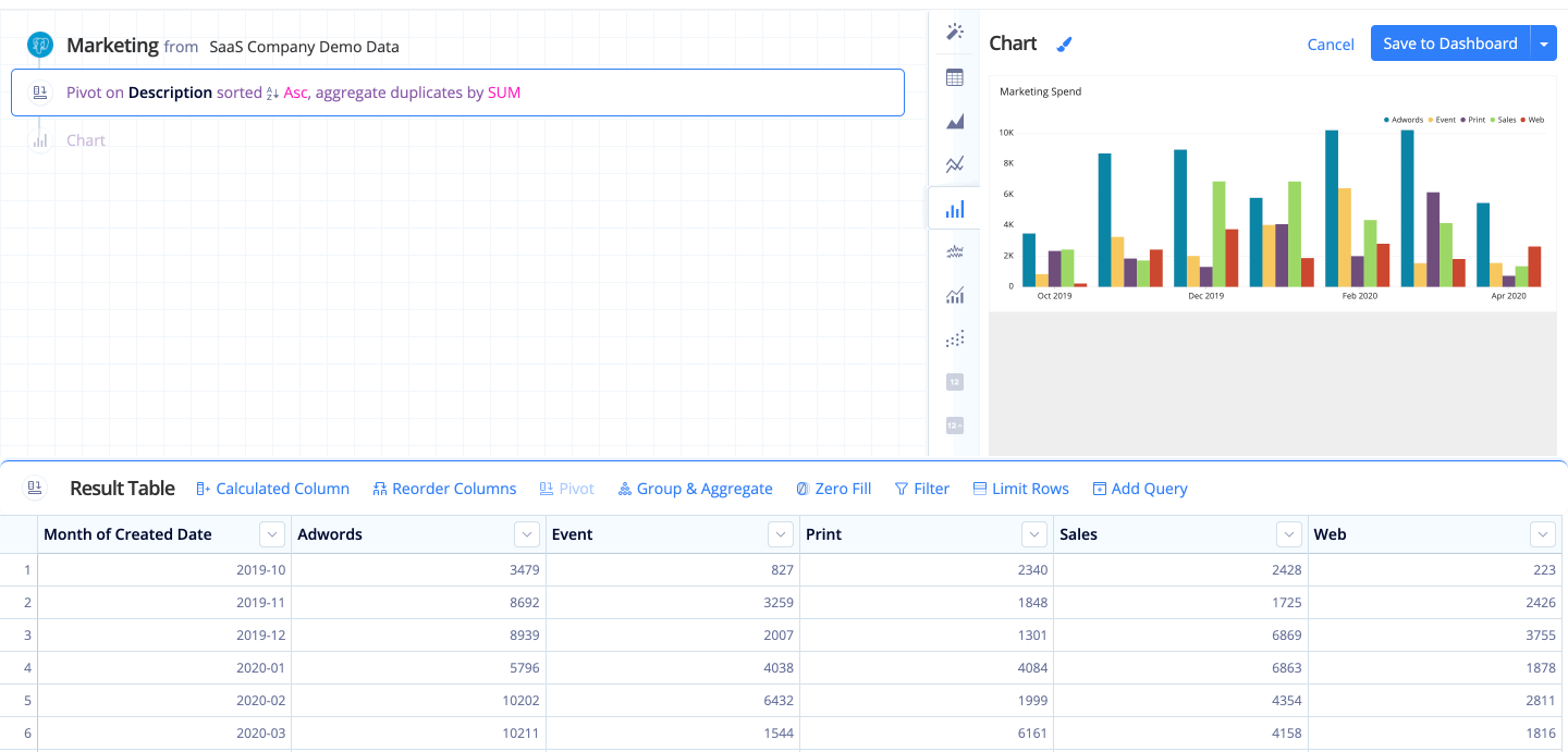
Unstacked Bar charts allow for an equal comparison of each component.
-

- Sort series
- Editable when Stacked is selected
-
Sorts the stacked Bar layers:
- Default: Sorts by the original grouping order
- Ascending: Sorts the Bar layers by their values, going from the least to the most
- Descending: Sorts the Bar layers by their values, going from the most to the least
- Horizontal
- When selected, turns your Bar chart to a horizontal Bar chart, reversing the x- and y-axes
-
Bar charts are helpful when comparing data across different categories. When dividing your data by ranked or non-continuous groups (basically things other than time), it can be helpful to switch to a horizontal Bar chart. It’s more natural for Western readers (we’re used to reading lines of different lengths aligned to a left edge), and especially helpful when you have longer labels on your bars (see Value labels under the Series tab).
-
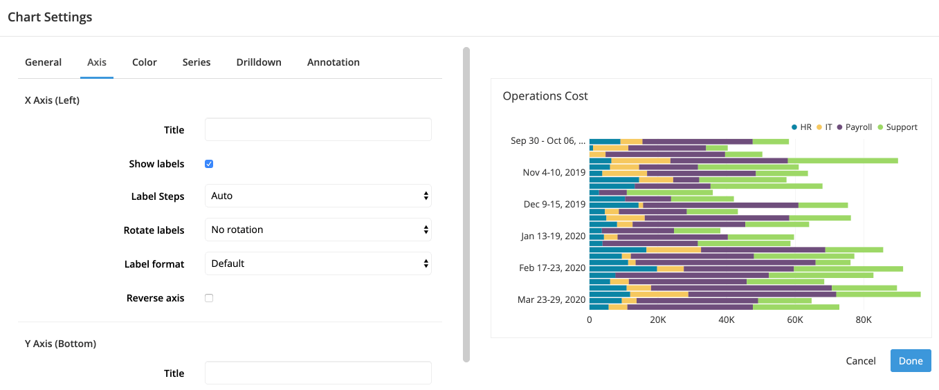
Axis
X Axis
“Title”, “Show labels”, “Label steps”, “Rotate labels”, and “Label format” can be found in the Axis section of our Chart Settings page.
- Reverse axis
- Editable when Horizontal is selected
-
Reverses the values of the x-axis (visually, the y-axis) for horizontal Bar charts
-
Y Axis
“Title”, “Show labels”, “Rotate labels”, “Label format”, and “Range override” can be found in the Axis section of our Chart Settings page.
- Percentage
- Changes your y-axis to show percentages (visually, x-axis if Horizontal is selected)
-
Charts with a percentage axis are sometimes called 100% stacked charts and are useful for displaying ratios without focusing on individual values.
-
- Logarithmic scale
- Editable when Stacked is unselected
-
Displays the y-axis on a logarithmic scale
-
Color
“Background color” and “Use custom colors” can be found in the Color section of our Chart Settings page.
Only have two columns but you want different colored bars for your Bar chart? Check out our FAQ about how to do that: Multi-colored bars in a Bar chart
Series
- Crisp bar edges
- Sharpens the bar edges
- Value labels
- Shows the values of each bar directly on the chart
Drilldown
Check out Drilldowns for more information on this tab.
Annotation
Check out the Annotation section from the Chart Settings page for more details.