Multi-color Bar chart
If you only have Bar chart made using only two columns, this results in all your bars having the same color. If you want each bar to have a different color, you add your grouped column to the Columns section again then use the Pivot Action. Each bar should now have a different color! You can customize the colors further with the Use custom colors option.
Here’s a more concrete example:
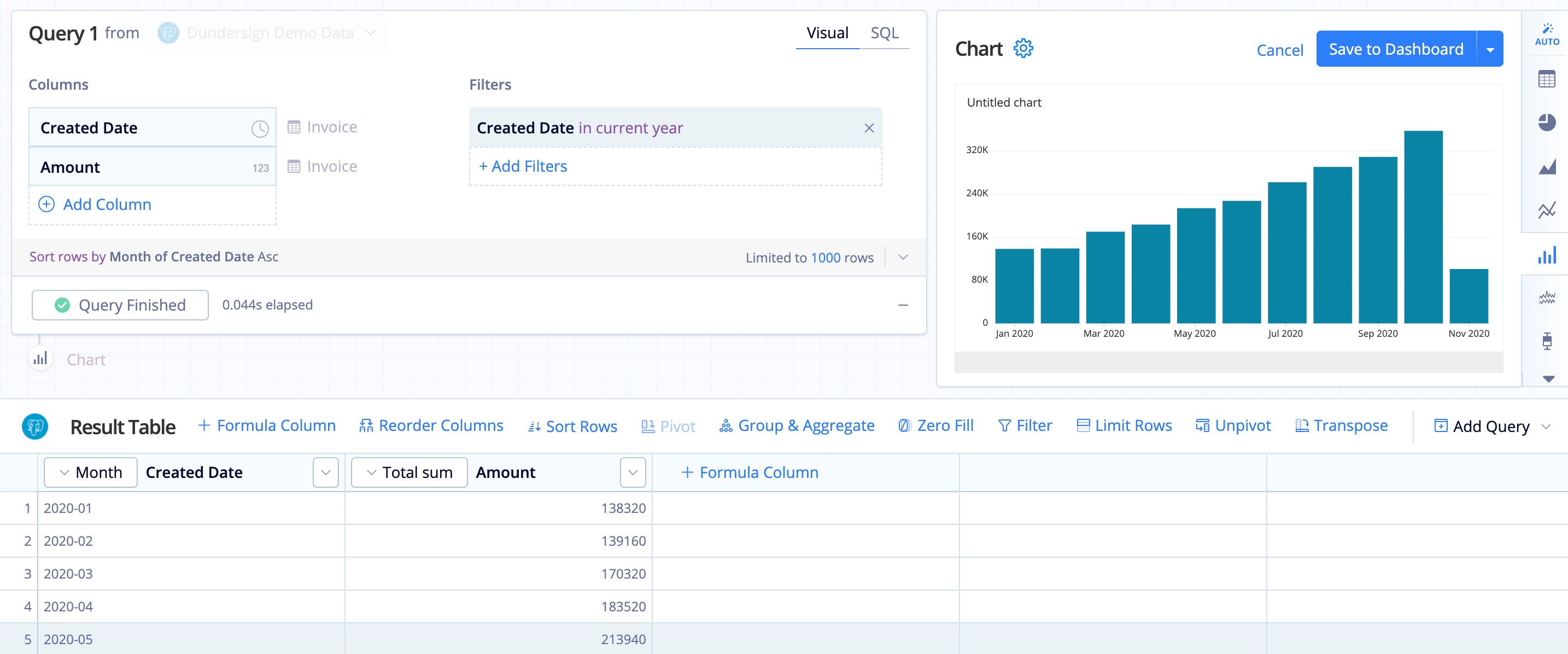
Let’s say we want to view the marketing spend over time. Using our Dundersign Demo data source, we initially add the Created Date and Amount columns from the Invoice table, run the query, then select the Bar chart type. Notice how our Bar chart uses the same color for each bar.
To use different colors, we add the Created Date column to the Columns section again (making sure it has the same time bucket as the original—in this case, we use the Month time bucket), which now gives us three columns. Make sure the second Created Date column is the second column in the Result Table (if it’s not, use a Reorder Action to move it) then use a Pivot Action to reformat the data. When we select the Bar chart type again, we now have a multi-colored Bar chart!
Here’s the final Bar chart!
