Auto-select Chart Type feature
Because it isn’t always immediately evident which chart type would provide the best visualization of data, Chartio is able to intelligently consider the format of the result set—along with decisions made by other Chartio users about similar result sets—to automatically choose a chart type that best fits your data.
To take advantage of our Auto-Select feature, collect your data from your various sources using our chart editor, combine and manipulate the results in our Pipeline as normal, then click the Auto button in the list of chart types next to the chart preview. You can click this button at any time, regardless of whether you’ve already manually chosen a chart type or not.
| In the Visual SQL interface |
|---|
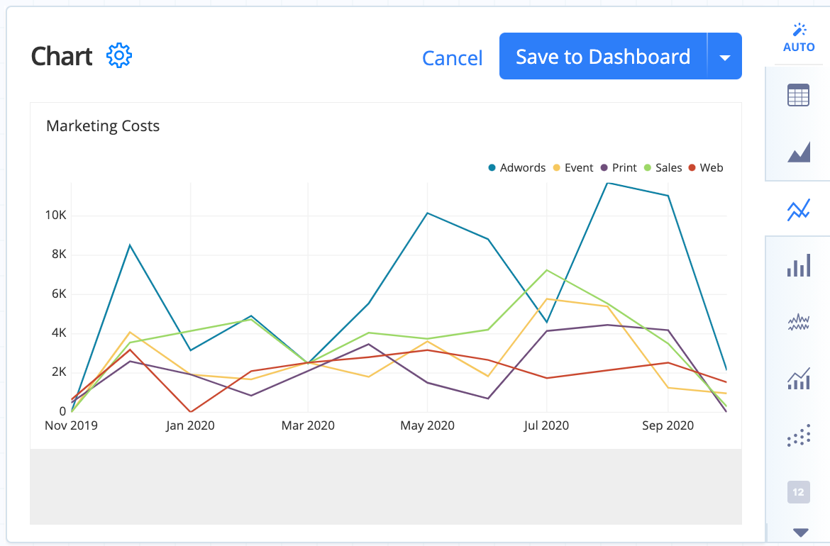 |
| In the Data Explorer interface |
|---|
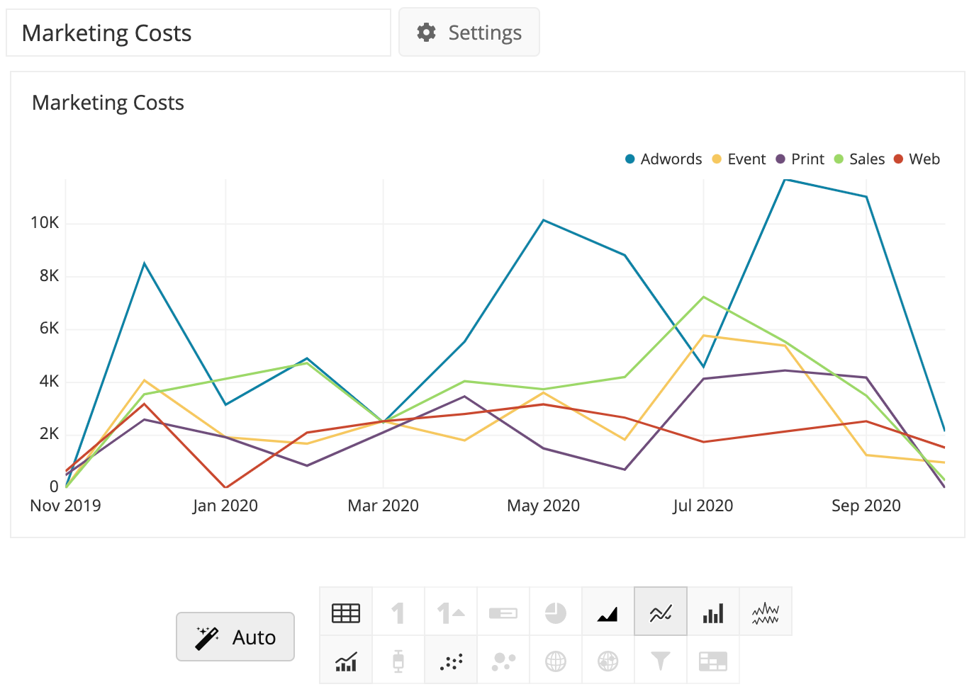 |
This feature works because Chartio has gathered metadata about thousands of charts that have already been created by our users. Analysis of these result sets’ characteristics (e.g., the number of rows, number of columns, and the data type of each column) allows us to recommend an appropriate presentation of your results.
Chartio uses machine learning to recommend chart types that best display your information in it’s current form. Thus, as is the case with most applications of machine learning, the behavior of this feature will likely evolve over time as it becomes exposed to more training data and as the algorithm is tweaked.
Chart types that are grayed out are not appropriate for the current format of your data. If you’d like to use a chart type that isn’t available, click on your preferred chart type to see more information about the format that you need to have to use that chart type. You can then continue to aggregate or manipulate (e.g., reorder, hide, pivot or combine your columns) to match the required format for your desired chart type.