Compare years using a Line chart
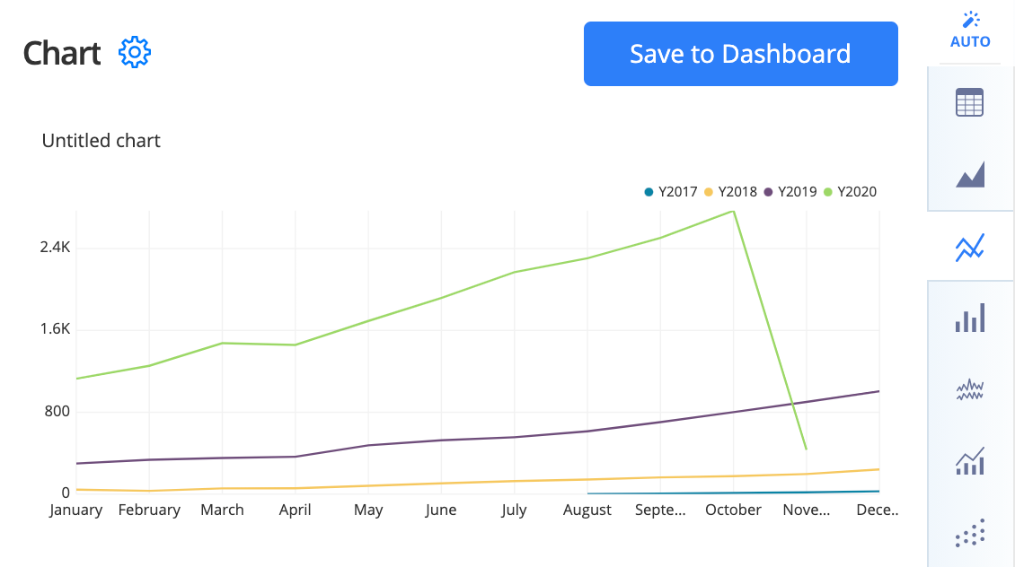
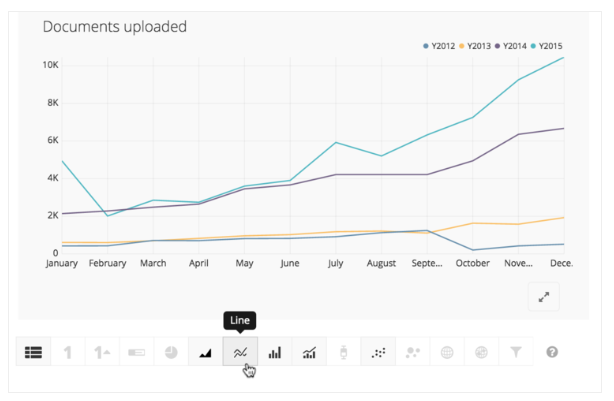
In this example, we have the documents that were signed on a specific date. We’re interested in summarizing the total number of documents by month, but highlighting year-over-year trends. We’ll analyze the Count of Documents.Id by Date Uploaded.
In the Visual SQL interface
- Using our Dundersign Demo Data data source, we’ll add the Created Date and Id columns from the Documents table.
- We’ll then change the group/aggregation for these columns in the Result Table:
-
For Created Date, change the time bucket to Month of Year.
Note: The “Month of Year” time bucket is different from the “Month” time bucket.
-
For Id, use the Count of distinct aggregation to give the total number of unique documents.
-
-
Here’s where things get exciting! We’re going to add Created Date to the columns section a second time, but this time we’ll select the Year time bucket from the aggregation menu. The combination of all these columns will give the number of documents created by Calendar Year and by Month. Omitting the Year of Created Date would result in a total of all documents created for a given month—for instance, January—regardless of the year.
Once you’ve added and modified the columns, run the query to get the preliminary results.
-
For the final step of our data formatting, we’ll add a Pivot Action to summarize the document counts by month for each year. This will allow us to view our data as a Line chart where each line represents a calendar year.
To make things a bit clearer, we also renamed the first column to Month of Year.
-
Change your chart to a Line chart, and you’ll see a year-over-year comparison of your data.
In the Data Explorer interface
-
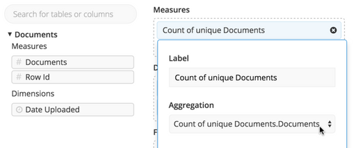
Starting in the Chart Builder, we will select our data source from the left side panel, and open the Table that contains our document details. We will drag our Documents Id column to Measures, and click it to open its settings. We’ll select Count of unique for the aggregation. This will give us a sum of the total number of unique documents.
-
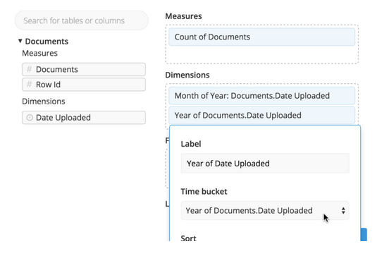
Next, we will bring the Date Uploaded to dimensions, and select Month of Year from the Periodic section of the Time bucket dropdown. Note this will be a different aggregation than selecting “Month of Date Uploaded” from the Continuous section.
-
Here is where the magic happens. We’re going to drag Date Uploaded to Dimensions a second time, and this time we’ll select Year of Date Uploaded from the Time bucket dropdown. The combination of these two filters together will sum the documents updated by Calendar Year and by Month. Omitting the Year Dimension would result in a total of all documents uploaded for a given month, say January, regardless of the year.
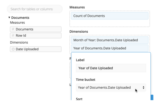
- Once completed, we will run the query to get our preliminary results.
-
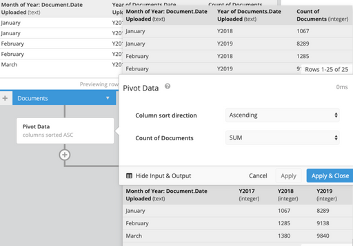
Lastly, we’ll add a Data Pipeline pivot data step to summarize the document counts by month for each year. This will allow us to view our data as a line chart where each line will represent a calendar year.
-
Change your chart to a line chart, and you’ll see a year over year comparison of your data.
