Create a cohort analysis chart
A cohort analysis looks at related groups of users (i.e., cohorts) and their behavior for a specific metric over a defined period of time, which can provide insights about your customers’ lifecycles. We’ve got a great Data Tutorial that goes more in-depth about what a cohort analysis is and how it’s useful, so check it out if you’d like to learn more.
In this example, we’ll show you how to create a cohort analysis Table chart in Chartio. Generally, there are two approaches you can take to create your cohort analysis:
Option 1: Using custom tables to pre-aggregate your data
If you have a lot of data (that would likely hit our row limits while creating a chart), we recommend pre-aggregating your data using a custom table to only pull the information that you need for creating the cohort analysis chart.
-
Go to your Data Sources page, select the Dundersign Demo Data data source, then go to its Schema tab.
Note: If the Dundersign demo source isn’t available, you can add it to your org by clicking +Add Data Source from the Data Sources page then selecting it from the list of data sources.
-
Create a new custom table to the schema by clicking Add Custom Table.

-
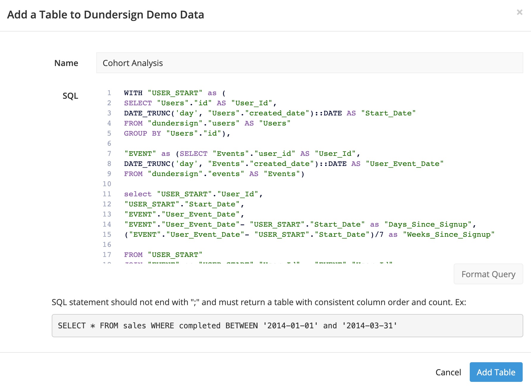
Give the custom table a name (e.g.,
Cohort Analysis) and use the following SQL to create the table:WITH "USER_START" as ( SELECT "Users"."id" AS "User_Id", DATE_TRUNC('day', "Users"."created_date")::DATE AS "Start_Date" FROM "dundersign"."users" AS "Users" GROUP BY "Users"."id"), "EVENT" as (SELECT "Events"."user_id" AS "User_Id", DATE_TRUNC('day', "Events"."created_date")::DATE AS "User_Event_Date" FROM "dundersign"."events" AS "Events") select "USER_START"."User_Id", "USER_START"."Start_Date", "EVENT"."User_Event_Date", "EVENT"."User_Event_Date"- "USER_START"."Start_Date" as "Days_Since_Signup", ("EVENT"."User_Event_Date"- "USER_START"."Start_Date")/7 as "Weeks_Since_Signup" FROM "USER_START" JOIN "EVENT" on "USER_START"."User_Id" = "EVENT"."User_Id" WHERE ("EVENT"."User_Event_Date"- "USER_START"."Start_Date")/7 >= 0What is this SQL code doing? It uses two Common Table Expressions (CTEs) and joins them together:
-
The first CTE (USER_START) pulls in each user’s ID and their corresponding start date (i.e., the date the user was created in our system).
Note: If you don’t have reliable start dates for your users, you could alternatively pull the minimum event date performed by each user.
-
The second CTE (EVENT) pulls in the date each event takes place and user ID of whoever performed the event.
The SELECT statement is where we create the columns we think we’ll need for our cohort analysis and join these two CTEs by the User_Id columns.
- Days_Since_Signup calculates how many days the event was performed since the user started.
- Weeks_Since_Signup does the same calculation but divides the result by 7 to get the number of weeks.
Click Add Table to create your new custom table.
-
- Now that the data is prepared for you, click Chart from the top navigation menu to start making your cohort analysis table.
- Add the User_Id, Start_Date, and Weeks_Since_Signup to the Columns section and use the following aggregations for each column:
- User_Id: Count of distinct
-
Start_Date: Week
Note: Feel free to use a different time bucket—like Month—for the Start Date.
- Weeks_Since_Signup: Group
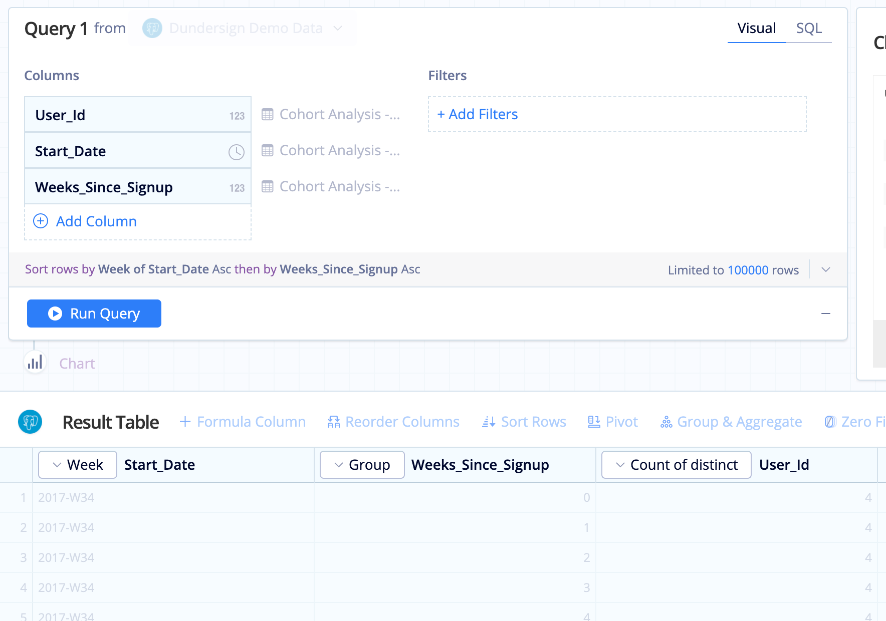
- Click Run Query.
- Ensure your columns are in the following order (left to right) and use a Reorder Action if necessary: Week of Start_Date, Weeks_Since_Signup, Count of distinct User Id
-
Use a Pivot Action to turn the values in your Weeks_Since_Signup column into column headers and aggregate any duplicates by SUM.

- Select the Table chart type and that’s it! You’ve got a cohort analysis where each row is a different cohort and each column indicates the number of activities in each period after their signup.
Option 2: Joining multiple queries in your chart
We highly recommend the custom table approach, especially if you have a large volume of data. It also standardizes the calculations of those required fields, making it easier for everyone in your organization to use them in their work.
However, if you’d prefer not to create a custom table, you can instead use multiple queries in your chart. But if you have a lot of data, you’ll likely hit our maximum row limit for query results, as mentioned earlier.
- Click Chart from the top navigation menu to start making your cohort analysis table.
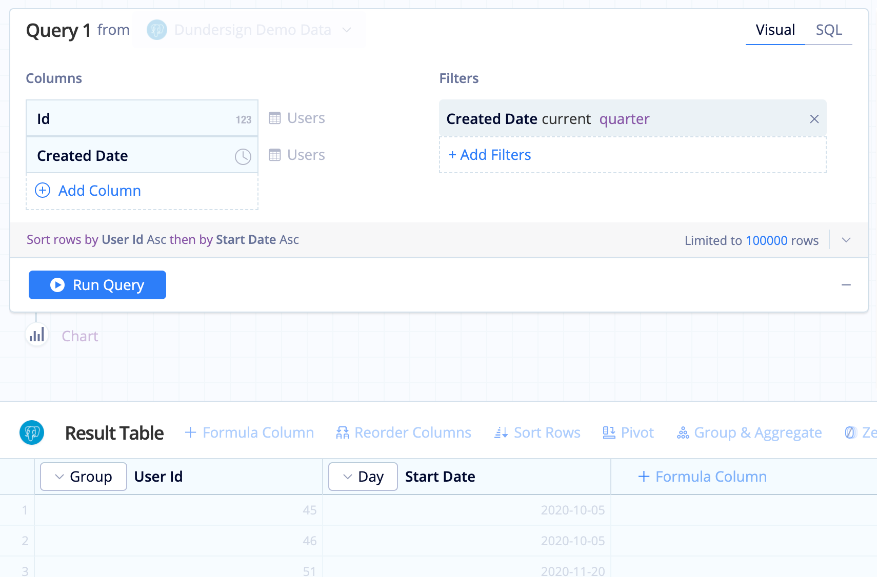
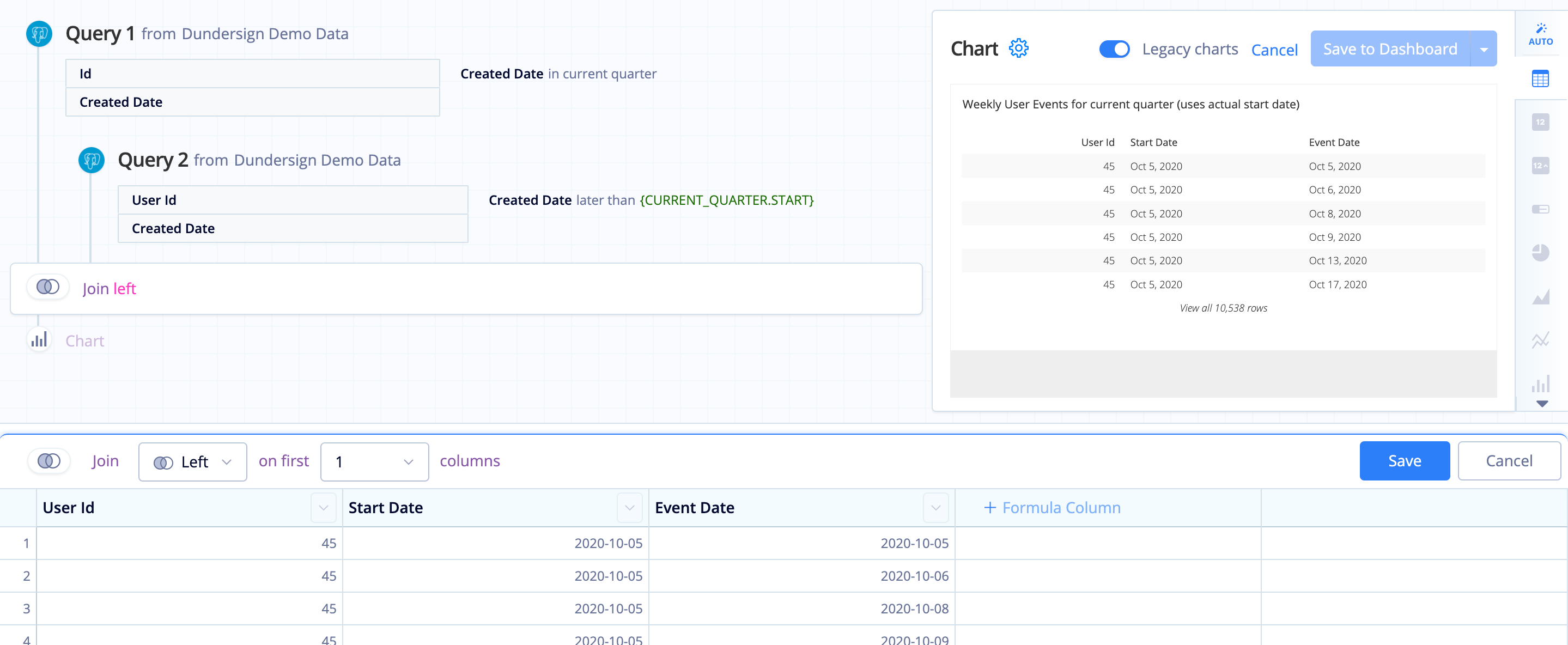
- For the first Query, use the Dundersign Demo Data data source to pull the signup dates of each user created in the current quarter.
- Add the Id and Created Date columns from the Users table to the Columns section and use the following aggregations for each column:
- Id: Group
- Created Date: Day
- To reduce the number of rows returned, we also added Created Date to the Filters section to only look at users created in the current quarter.
- Rename Day of Created Date to
Start Datefor clarity. - Click Run Query.
- Add the Id and Created Date columns from the Users table to the Columns section and use the following aggregations for each column:
- Add a new Query, which will look at the data you’re trying to track. For this example, we want to see the dates that users performed an event.
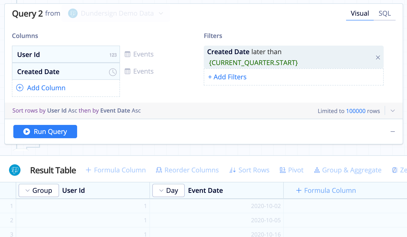
- Add the User Id and Created Date columns from the Events table to the Columns section. Again, use Group for User Id’s aggregation and Day for Created Date’s aggregation.
- If you filtered over a specific date range for Query 1, make sure to apply the same filter to Query 2 but use the date column from the Events table. In our case, we made sure to only look at events created after the start of the current quarter. We leveraged our
{CURRENT_QUARTER.START}Relative Date Variable to filter our data. - Rename Day of Created Date to
Event Datefor clarity. - Click Run Query.
-
Edit the Join Action and change the join type to Left so we only include rows pertaining to the users created in the current quarter.
-
Next, create a new column that will store the number of weeks since signup that the event occurred. To do this, add a Formula Column, select Custom as the formula type, then use the following formula:
cast(((strftime('%J', "Event Date") - strftime('%J',"Start Date") )/7) as INTEGER)What is this formula doing? It’s taking the Julian day of the event minus the Julian day of the start date then dividing by 7 to get the number of weeks it took for the user to perform the activity since their start date.
Rename this Custom Formula column to
Week of Event.
-
It’s not unusual to have messy data. In this case, our demo data source has events that happened prior to signup, which doesn’t make much sense, so we filter that data out using a Filter Rows Action.

-
Now change the Start Date to show the corresponding ISO week by using Apply Formula on the Start Date column, select Custom as the formula type, and use the following formula:
strftime('%Y-W%W', "Start Date")
- Since it’s no longer necessary, hide the Event Date column.
- Use a Group & Aggregate Action to change the aggregations of each column in the result set:
- User Id: Count of distinct
- Start Date: Group
- Week of Event: Group

-
Reorder the columns in this order (left to right): Start Date, Week of Event, COUNT(DISTINCT User Id)
-
Use a Pivot Action to turn the values in your Week of Event column into column headers and aggregate any duplicates by SUM.

- Select the Table chart type and that’s it! You’ve got a cohort analysis where each row is a different cohort and each column indicates the amount of activity in each period after their signup.
