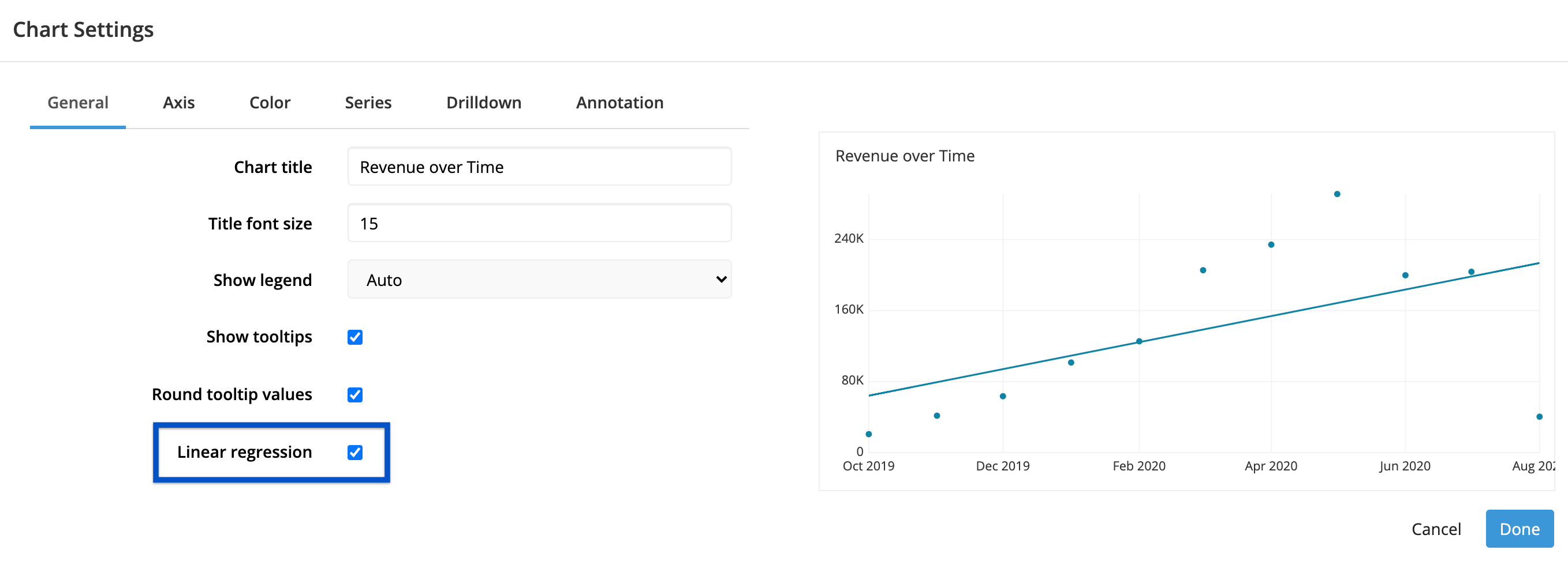
Linear regression line in Scatter Plot charts
A linear regression line shows the trend line of your Scatter Plot’s result set at a glance. It’s a straight line that best represents the data in the Scatter Plot and minimizes the distance of the actual scores from the predicted scores. This line is sometimes called the “line of best fit” because—as the name might suggest—it’s the line that fits best when drawn through the points; it may pass through some of the points, none of the points, or all of the points.
Check out our step-by-step video showing how to add a trend line to your Scatter Plot:
To add a line of best fit to your Scatter Plot, open the Chart Settings. Under the General tab, select Linear Regression.

Be sure to save your changes before exiting the chart editor!
As a final note, your trend line will use all the data present on your chart for the calculation. If you’d like to remove some outliers from the trend line calculation, you need to filter those data points from the chart as well. It’s not possible to just omit them from the regression line calculation.