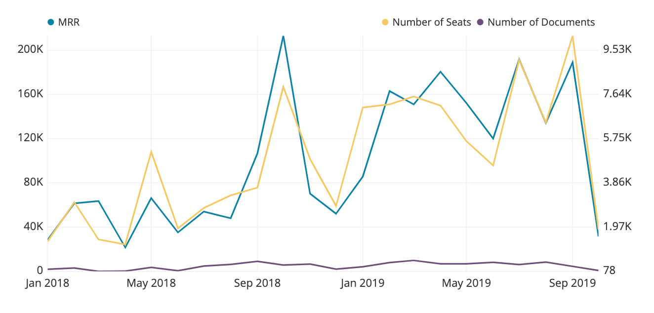
Dual Axis Line charts
In the Visual SQL interface
Let’s start by creating a Line chart with multiple aggregated columns and one grouped column–this process is the same as usual. In this example, we’ll use our Document Company Demo Data data source to compare the total MRR, total number of users, and total number of Documents uploaded per month.
After adding the necessary columns and adjusting the group/aggregation types in your Result Table, click Run Query then select the Line chart from our list of compatible chart types.
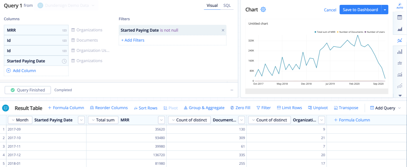
The Documents and Users lines have low numbers compared to the total MRR, making it difficult to see the trends in the chart’s current state, so we can use the Dual Y-axis option to better visualize this data on our chart.
Open the chart’s settings by clicking the Gear above the Chart Preview, switch to the Series tab, then select Dual Y-axis. Upon selecting this option, another field appears below it, allowing you to specify how many of the last columns to include on the right y-axis. In our example, we want the last two columns included on the right y-axis, so we set Last X Columns on the right axis to 2.
The chart preview in the settings automatically updates to reflect your new settings. Now it’s much easier to see the change in Documents and Users over time!
If everything looks good, click Done to save your chart settings.
Note: If you want your first column(s) to be on the right axis, rearrange your columns in your query or add a Reorder Columns Action in the Pipeline to move these columns all the way to the right (or to a lower position).
Rename your columns or customize your axis labels as needed then save your chart to a dashboard when you’re finished.
In the Data Explorer interface
Start by creating your Line chart with multiple measures and 1 dimension as usual. In this example, we’ll compare the total MRR, total number of Seats, and count of distinct Documents uploaded per month using our “Document Company Demo Data” demo Data Source.
Once you’ve added the the correct values to your chart, click Run Query and click on the Line chart icon below the chart preview.
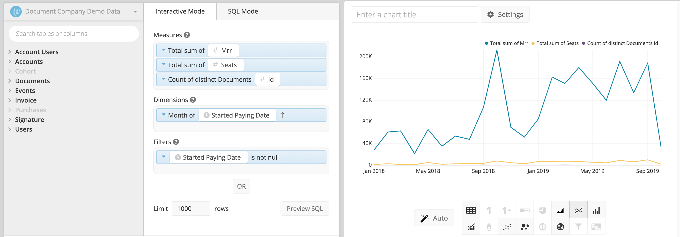
Open your chart’s settings by clicking on the Settings button located above the chart preview.

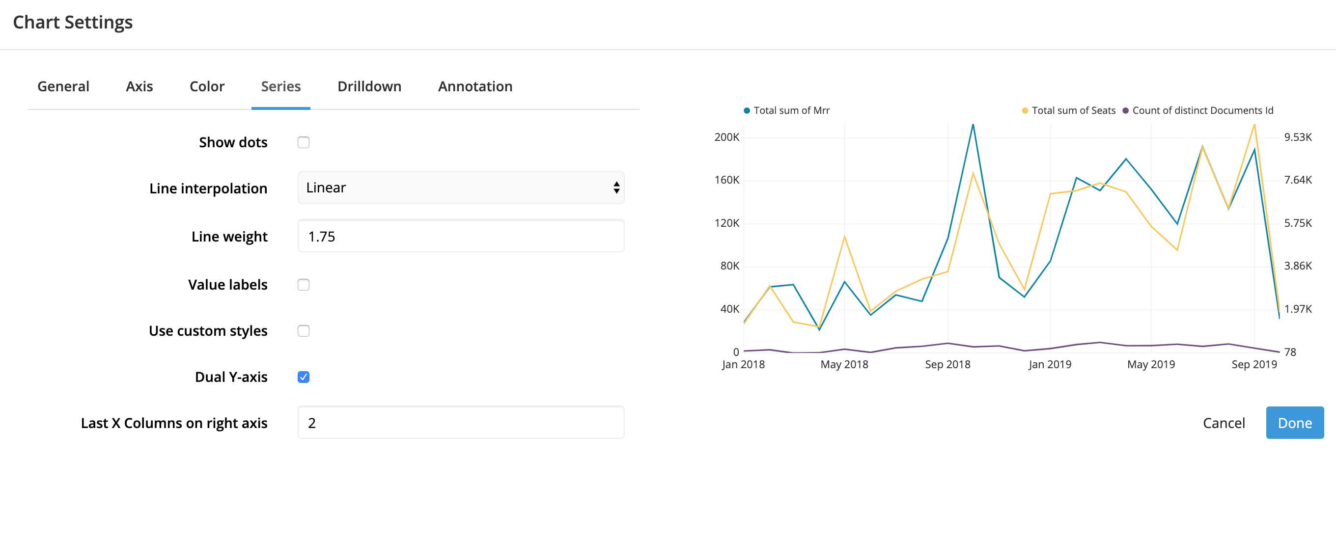
Switch to the Series tab and click the Dual Y-axis checkbox at the bottom of the tab.
An additional field will appear allowing you to customize the number of columns to be included on the right axis. We’ll enter a value by default here based on your query results but feel free to adjust as needed.
In this example, we want the last 2 columns to be on the right y-axis, so in the Last X Columns on right axis field, we’ll enter 2. The chart preview will automatically update with the new y-axis layout. If this looks correct, click Done after you’ve finished customizing your settings.
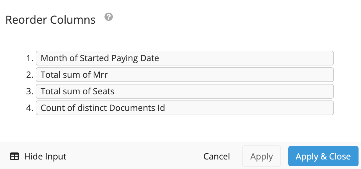
Note: If you want your first column(s) to be on the right axis, rearrange your measures in your query or add a Reorder Columns Pipeline Step in the Data Pipeline to move these columns all the way to the right (or to a lower position).
In our example, the Month of Started Paying Date is on the x-axis, the Total sum of MRR is on the left y-axis, and the Total sum of Seats and Count of distinct Documents Id are on the right y-axis.
You can then rename your columns or customize your axis labels as needed and save your chart once completed.
